ux/ui
web design
branding
Product design for AI creator marketing startup
Where
Remote
Role
UX/UI Designer
What
Responsive website
Category
Entertainment
Why
Commercial
When
March 2023
Project Overview
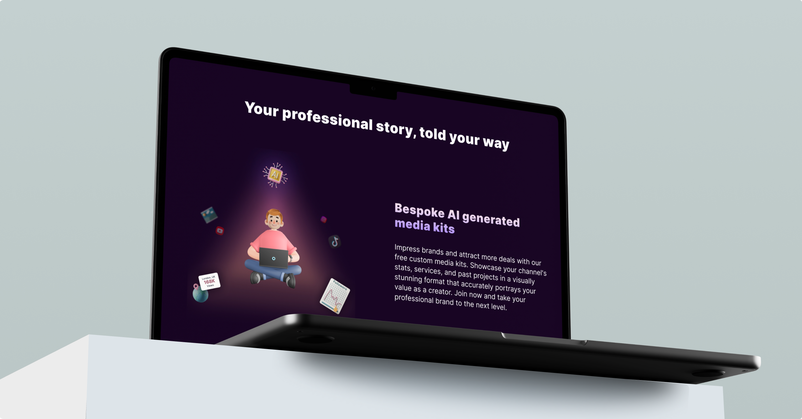
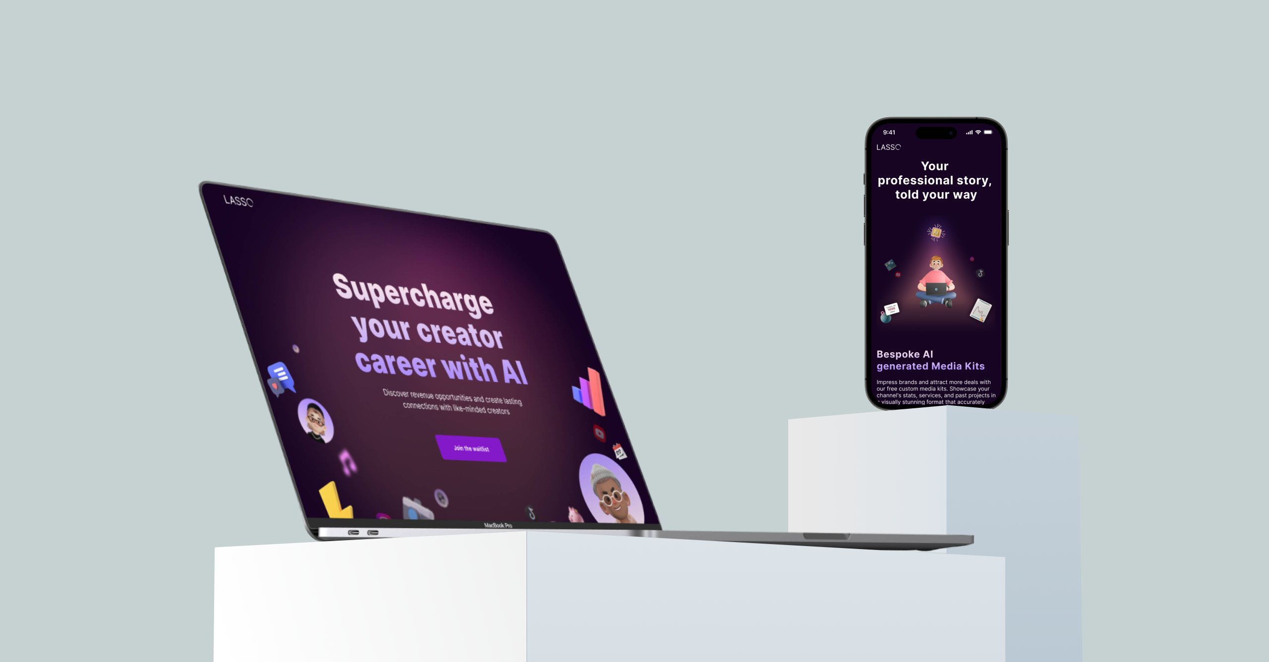
Lasso was started to empower creators across the world to grow their professional brands by leveraging the world's most powerful technology - AI. The founders experienced firsthand the pain of scaling influencer and creator marketing after working with the world's fastest-growing DTC and SaaS companies. Reaching your audience through partnerships should never be this hard, which is why Lasso was built for. The company is about to launch an innovative AI project with a "LinkedIn for creators" theme but with added creativity. We have developed a website to encourage user sign-ups and validate their new project scope.
Contents
(jump to the section)
1Project Overview
Process
• Project Definition & Scope
• Understanding the Problem
• Competitive Research
• Ideation
• High-Fidelity Mockups and Prototypes
• Usability Testing
• Design Handoff
• Quality Assurance
The team
• CEO
• Project Manager
• Engineer
• UX/UI designer (myself)
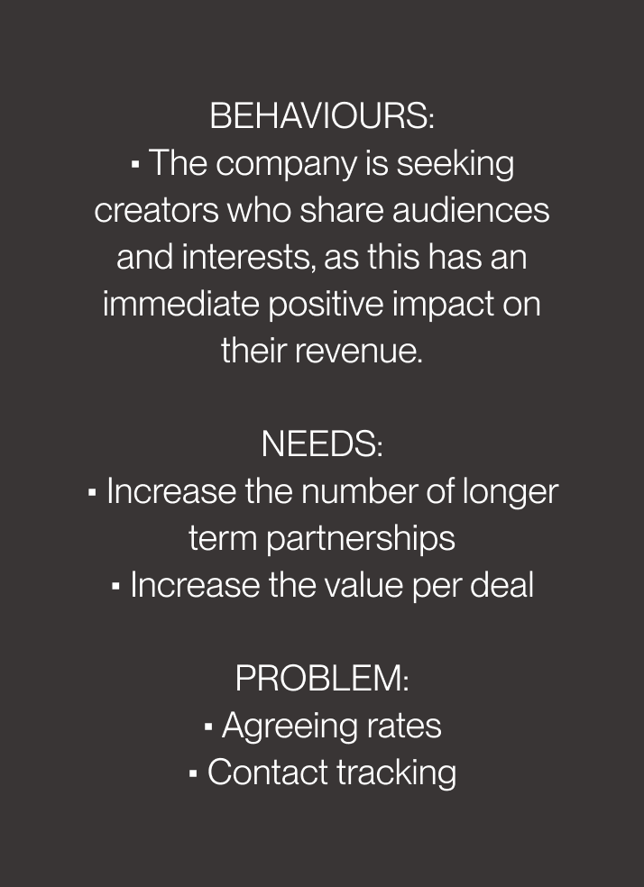
Problems
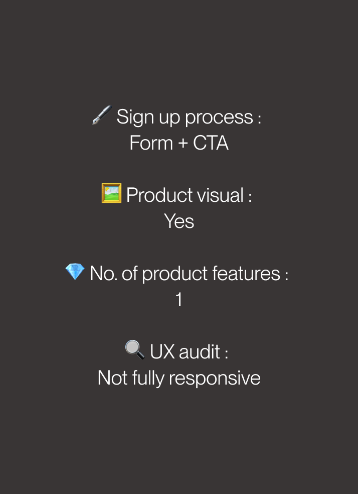
The company conducted user research and identified several pain points experienced by users.
Challenges
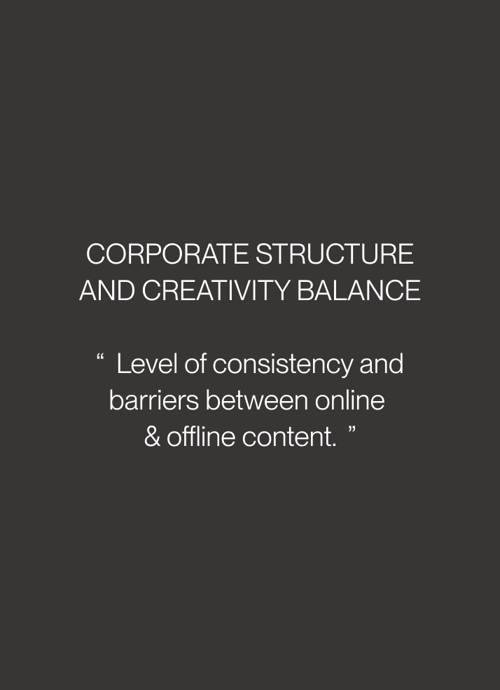
• Strike a balance of Creator x Professionalism with visual design.
• As a new player in the market, we want more commercial design that should appeal to a wider audience.
Understanding users
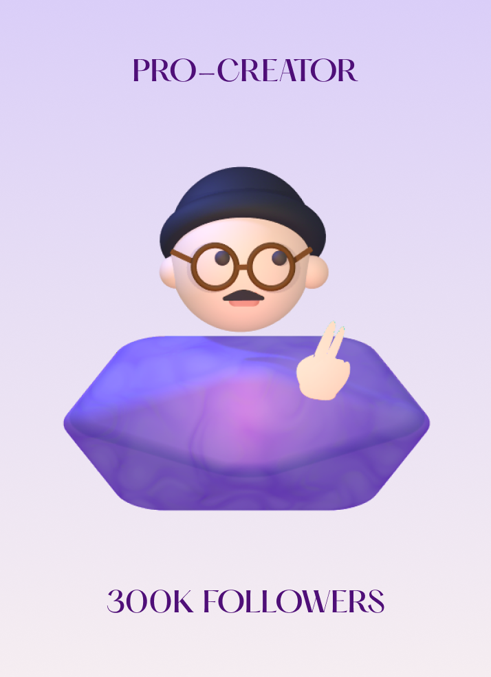
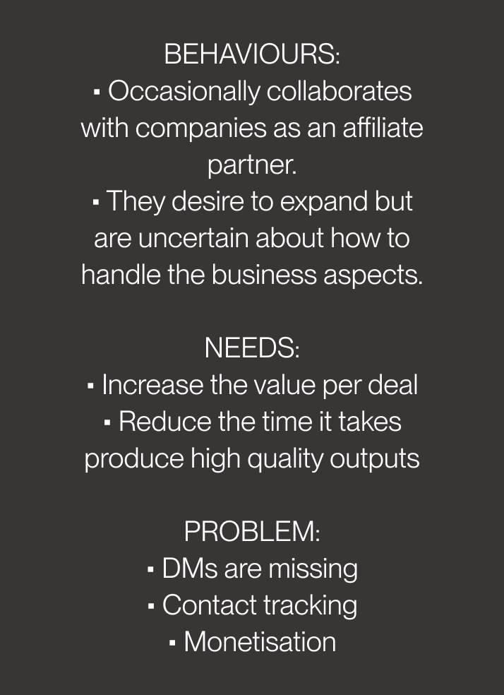
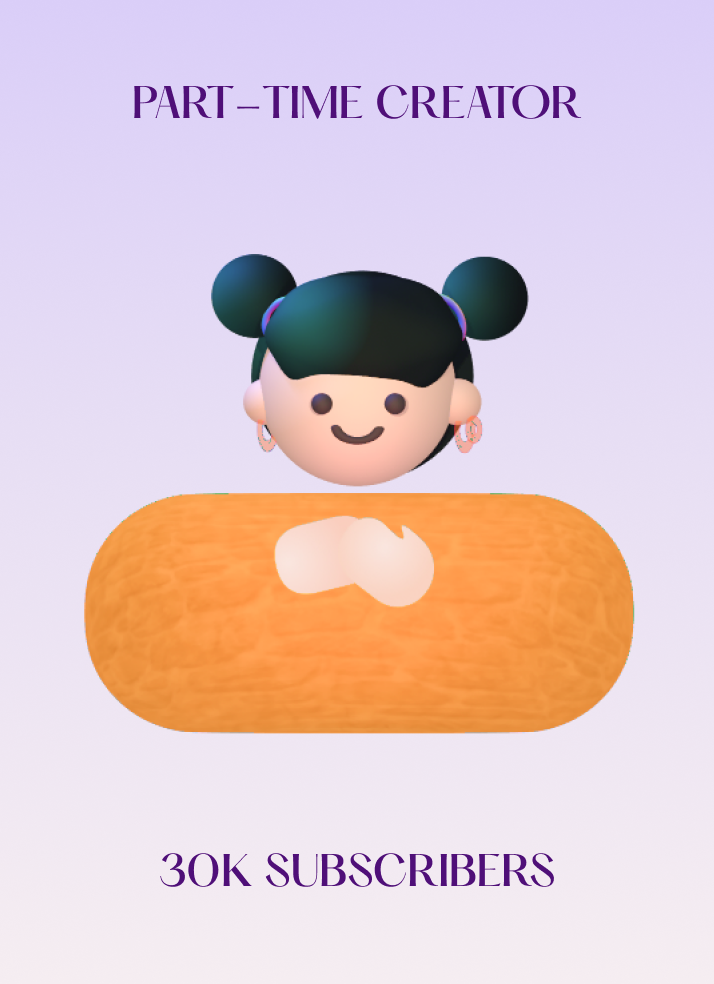
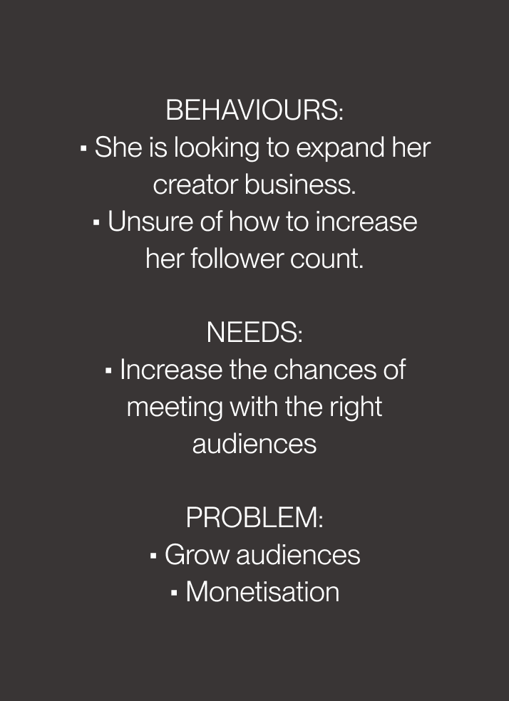
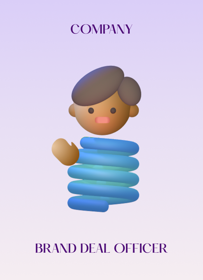
Persona
Based on the user research conducted by the company, I identify the problem from the user's perspective and create 3 types of user personas:
Competitive analysis
Before starting the design. I conducted a competitive analysis to understand the market better.

Design Ideation Process
Mood-board
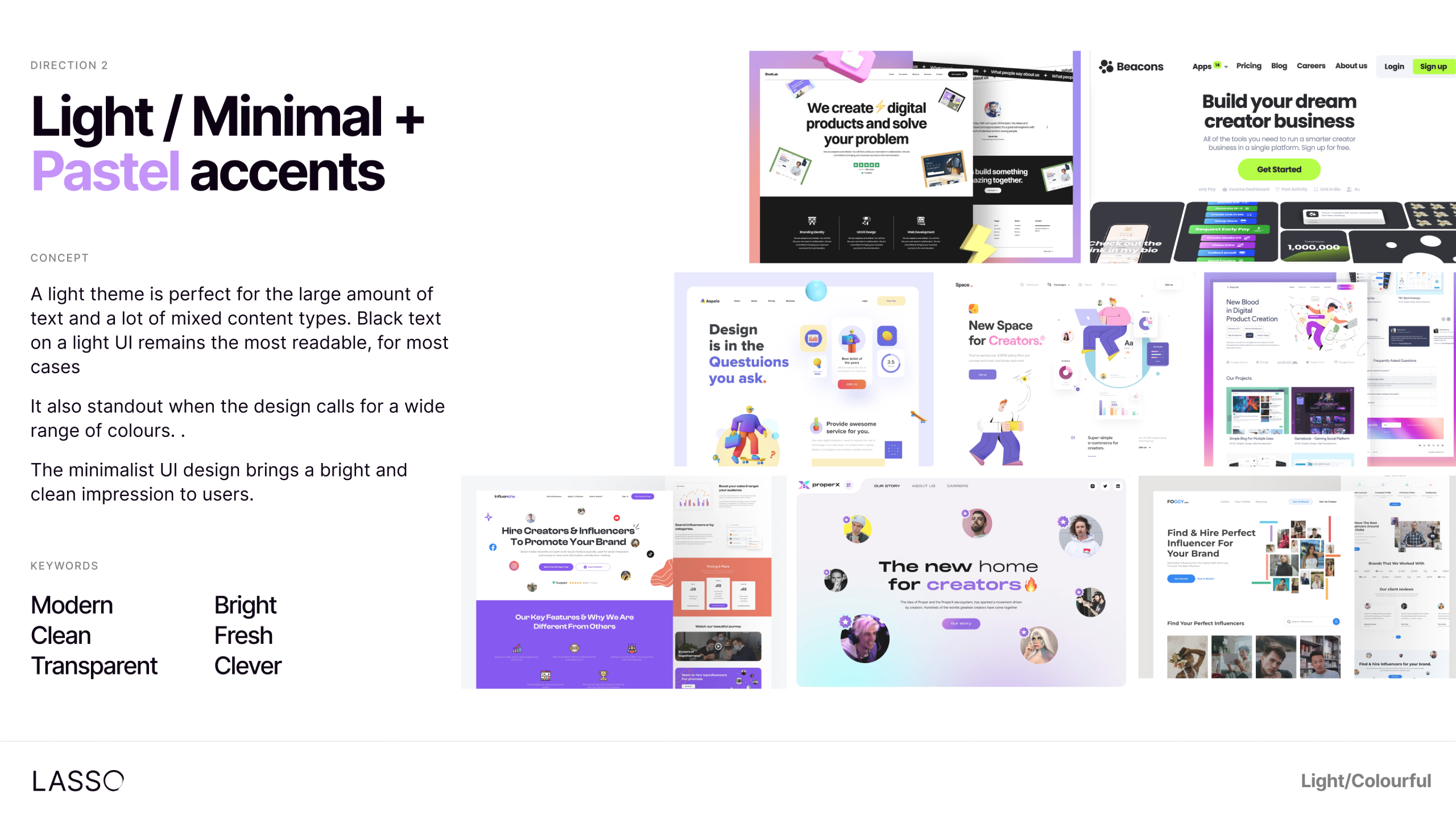
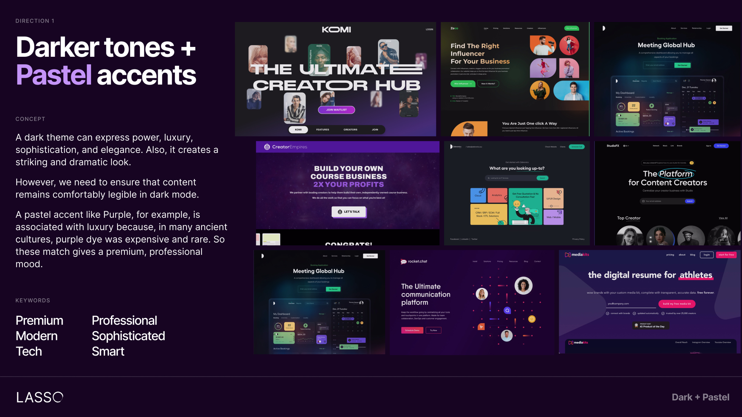
To ensure a cohesive design, we began by defining the concept's tone and created mood boards with both dark and light themes.
The client expressed a preference for the dark mode, which conveys a futuristic and premium vibe. As a result, we chose to incorporate a pastel accent into the dark mode design for this project.
1Light Tones
2Darker Tones
Idea generations
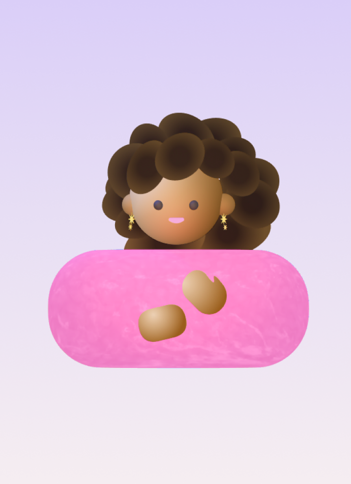
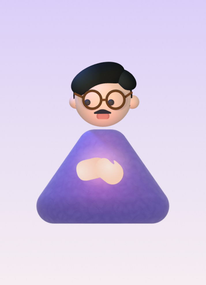
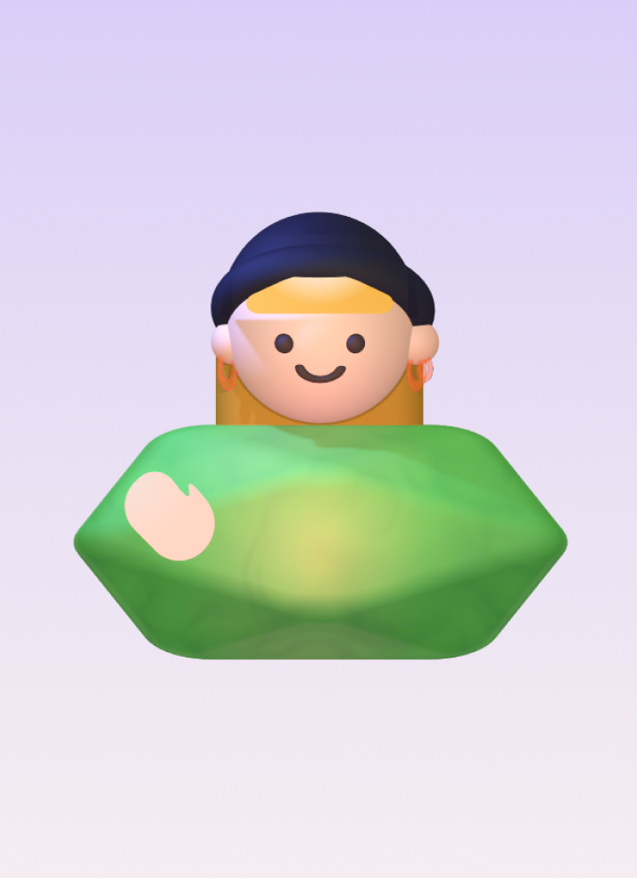
To represent our future users, we opted for 3D illustration avatars as we currently don't have active users.
This choice gives a more realistic touch:
• We aim for abstract product screens that provide a glimpse of our product.
• Our next plan is to elevate the demo product design to a modern, clean look.
I then create a Mid-fidelity wireframe based on these rough sketches to share with stakeholders.
Mid-fidelity wireframe
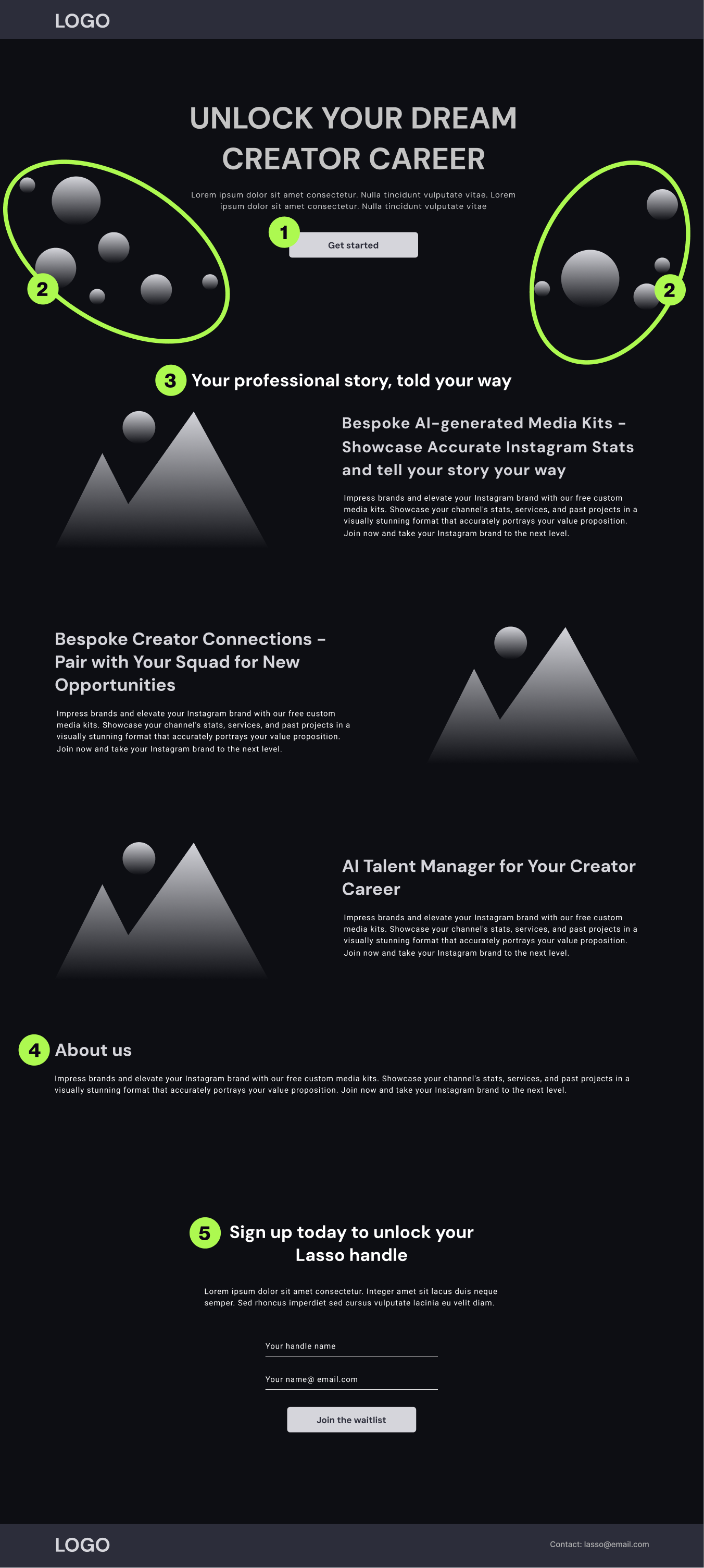
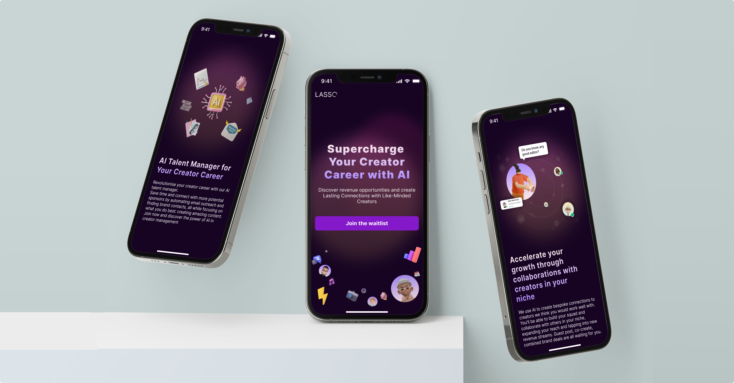
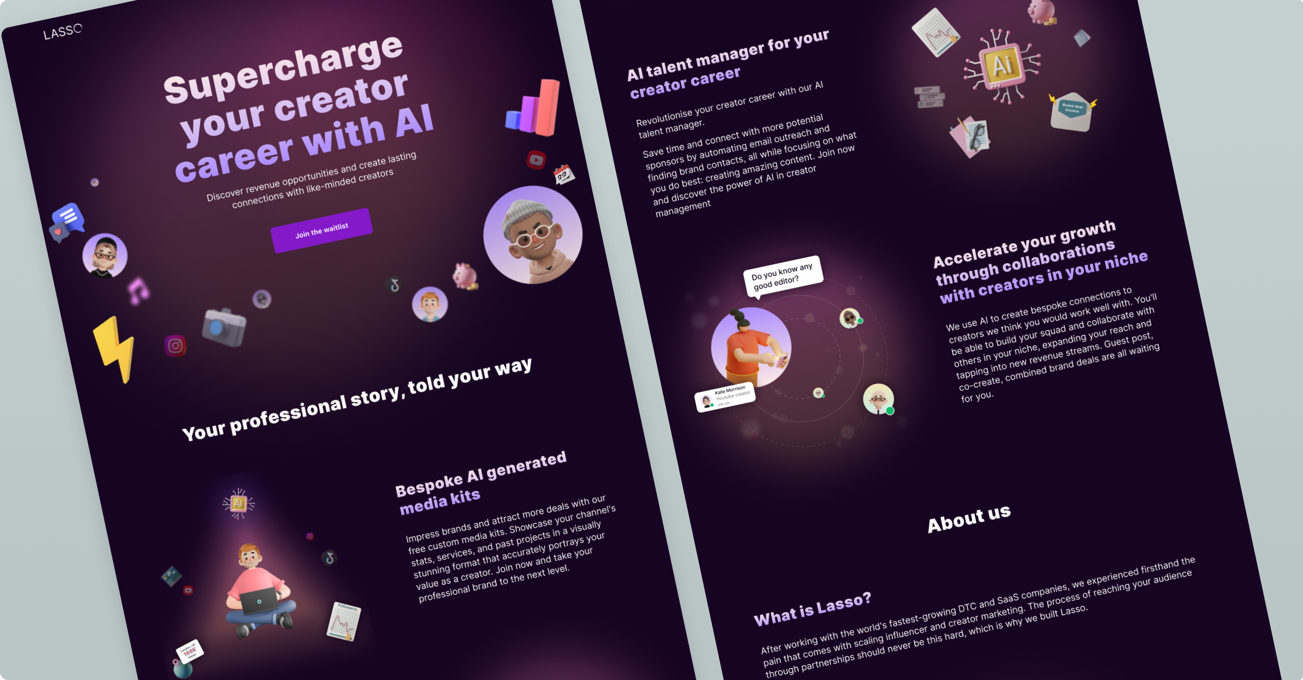
CTA
Our CTA aims to increase user sign-ups. The button connects to the sign-up form at the bottom of the page.
Users + Icons
The circles in the design represent potential users with social or creative icons. The hero design is intended to inspire and give users confidence in joining the Lasso community.
Product features section
We have three product features:
• 🤖 AI talent manager
• 🧶 Creator connection tool
• 🦄 Media Kit
The design of each section should be self-evident with key visuals. The goal is to make users feel the empathy and needs of the services.
About us
This section should be shorter and give reliability to its user for the product sign-up.
Sign-up form
This is the main purpose, the highlight of the landing page. A concise form design makes the user take the task easier psychologically.
design iterations
Next, I created detailed high-fidelity wireframes that were thoroughly tested with users to ensure optimal user experience and usability.
• Version 1
Hero title
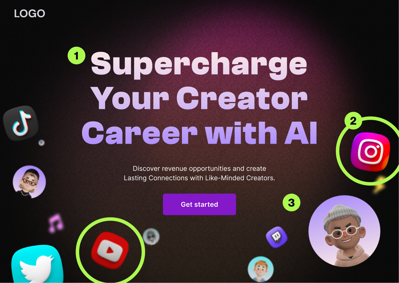
The typography for the initial version was slightly too stylish for their target audience. We prefer to target a wider audience who are not into design/arts.
Social icons
The social icons were too strong and it gave users misunderstanding impression of the product purpose.
Background noise
The version one design had a background noise for design touch. However, the next version took it for the better accessibility experience.
• Final Version
Based on the feedback, I have revised the designs, and the final result is as follows.
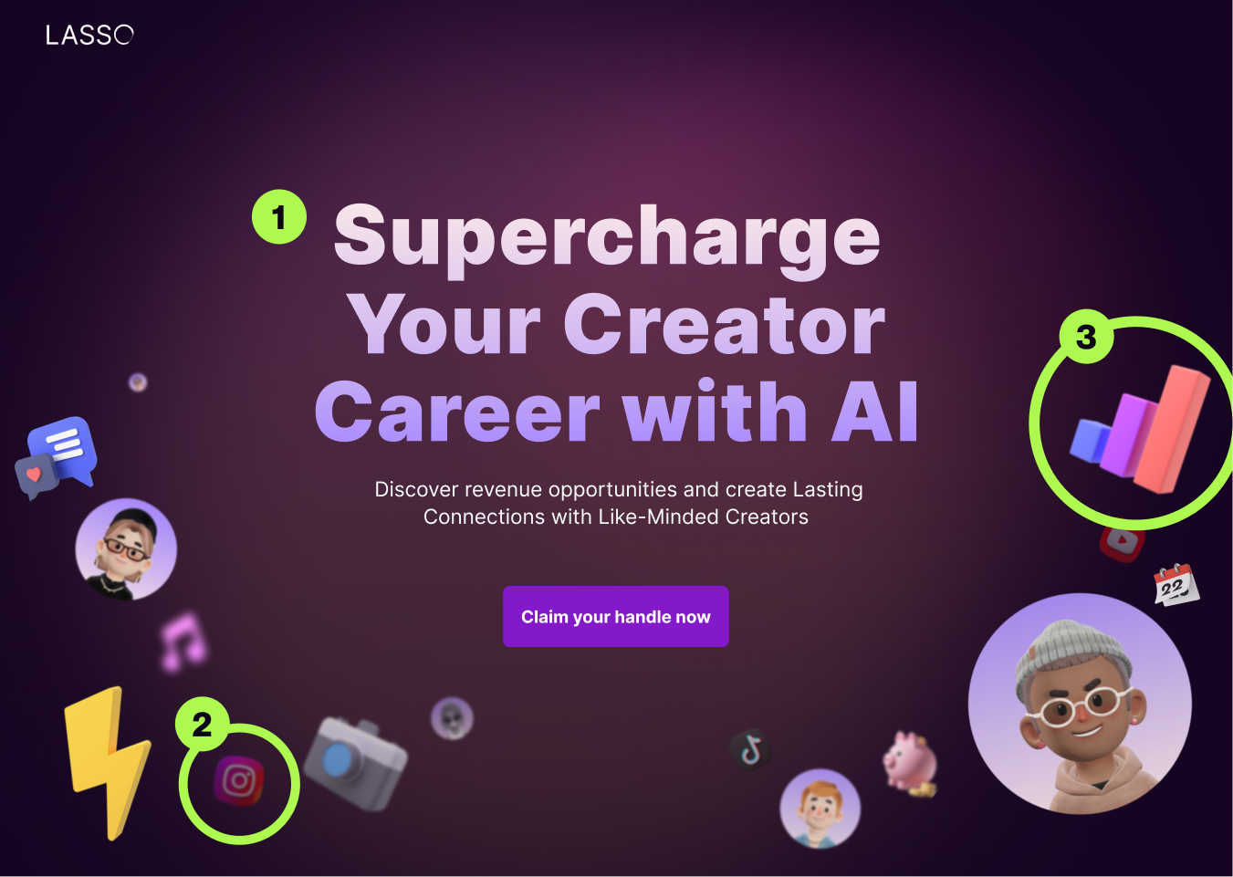
Hero title
The title typography changed to one that gives an impression of a clean and professional look.
Social icons
The social icons still remained but muted much more. However, users enable to understand the product is still related to social media.
Creative/Business focus Icons
In the previous designs, there was a heavy emphasis on creativity. However, the client requested that we focus more on the business side of the product in the design. After conducting user testing, we decided to strike a balance between the creativity and business aspects, and separated the design into two sections. One section for the right side(Business), and one for the left side(Creative).
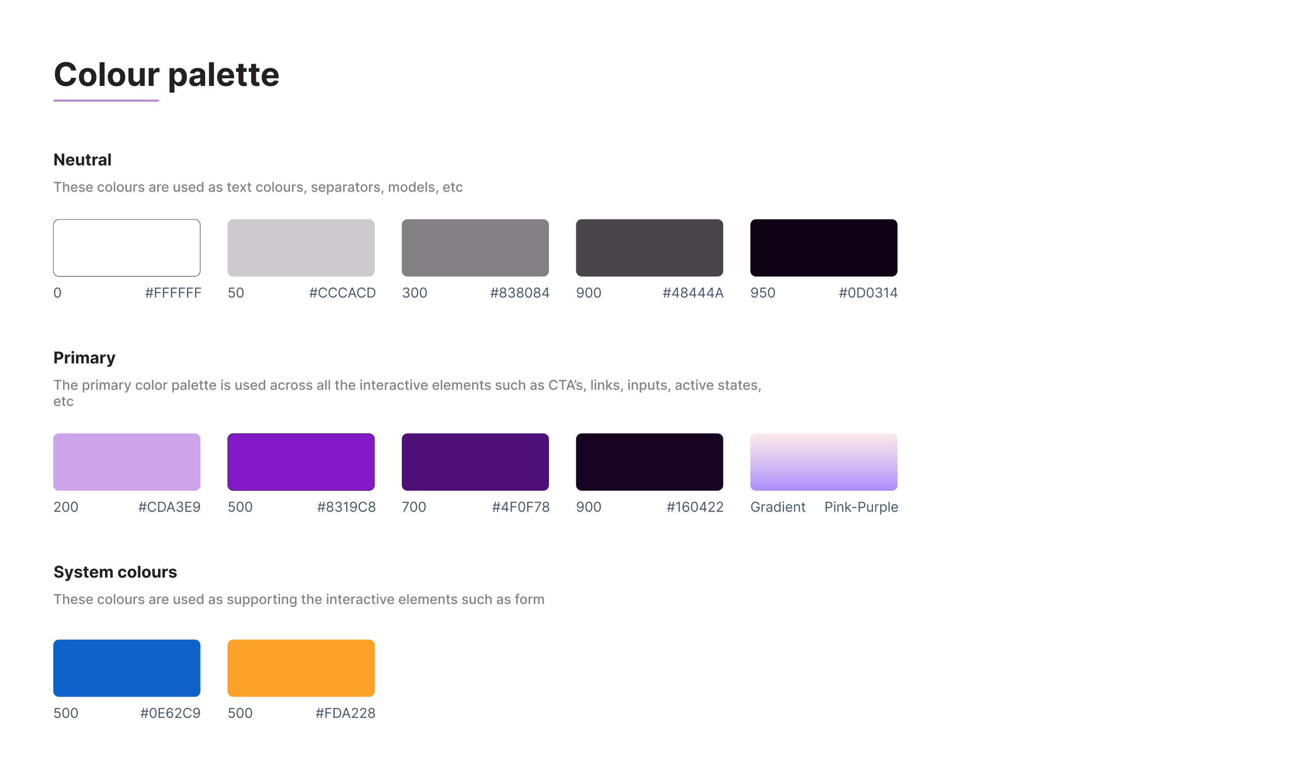
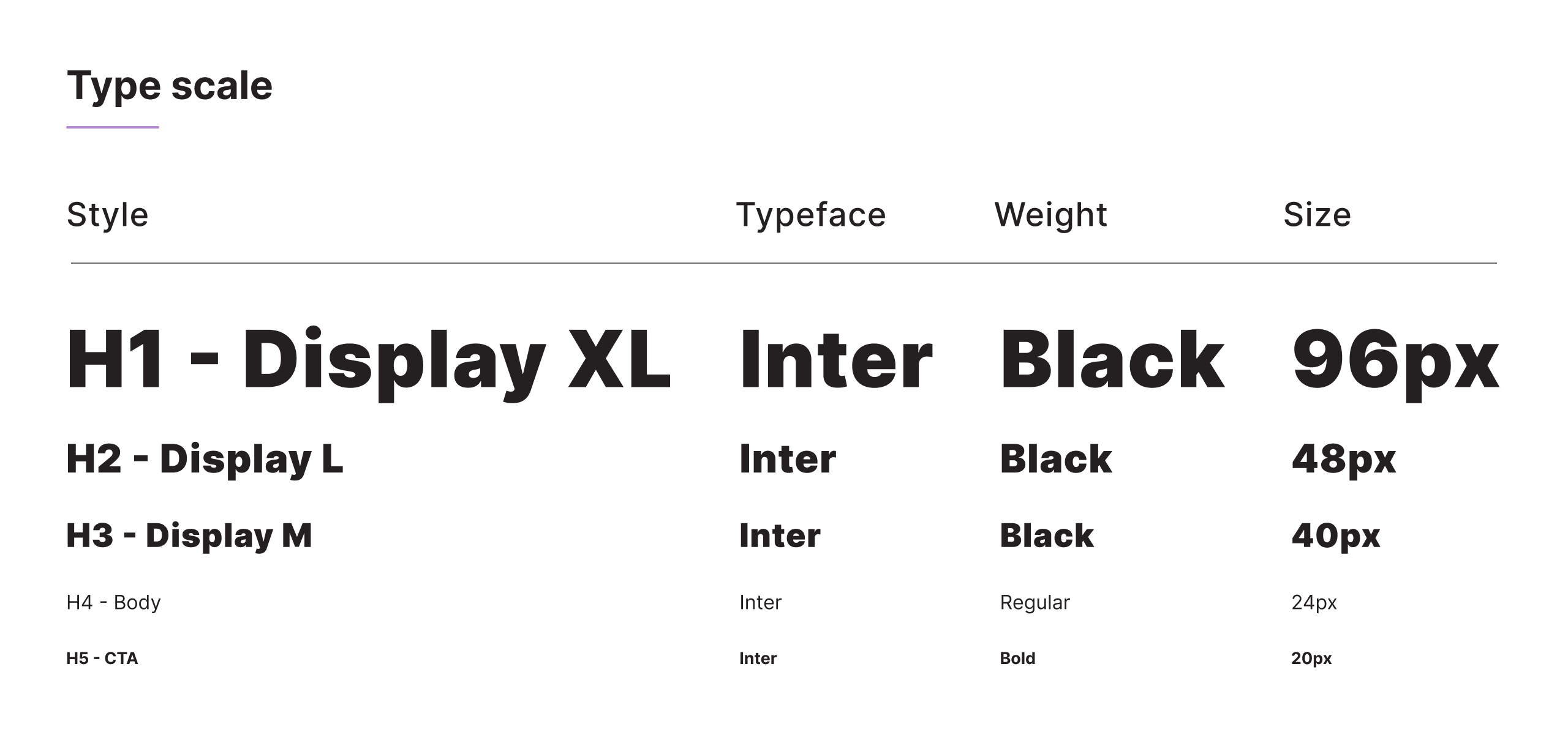
Design system
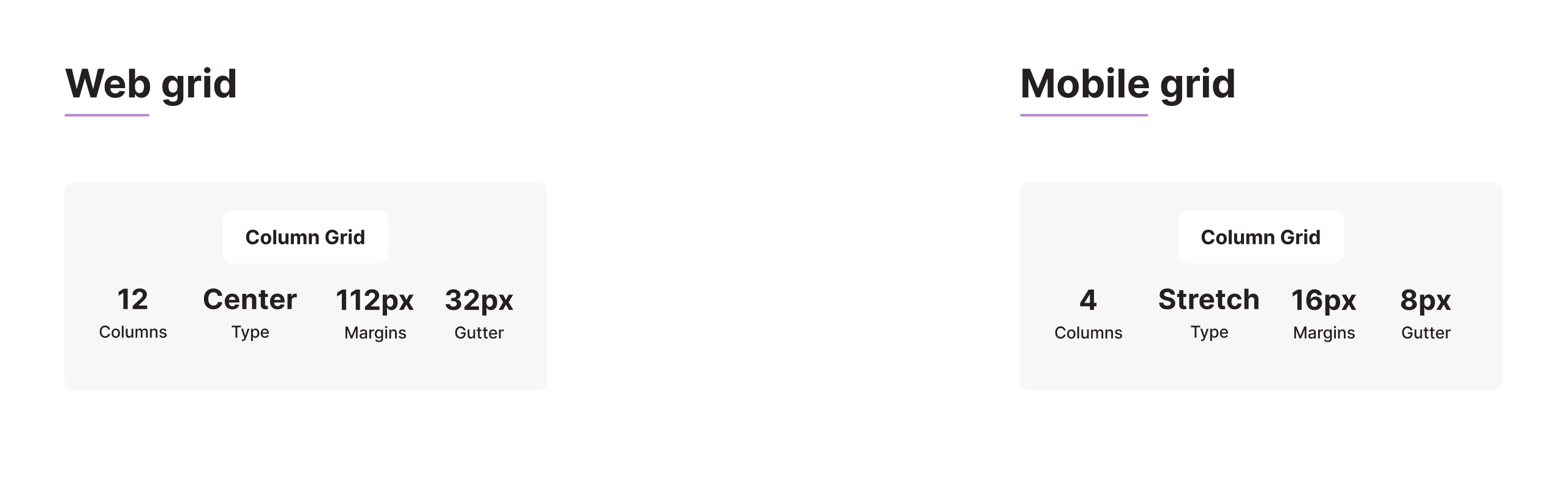
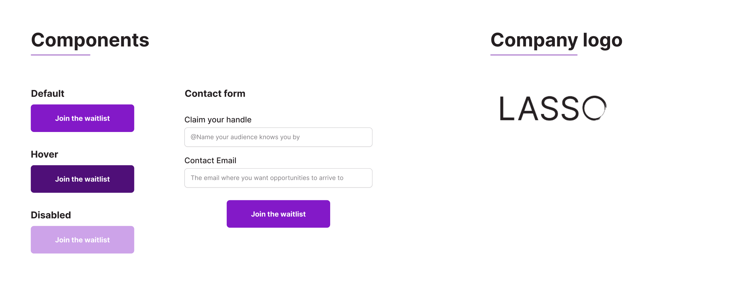
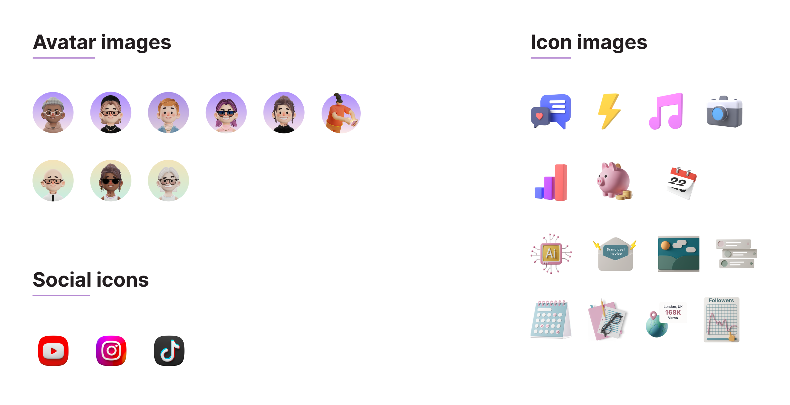
Final design
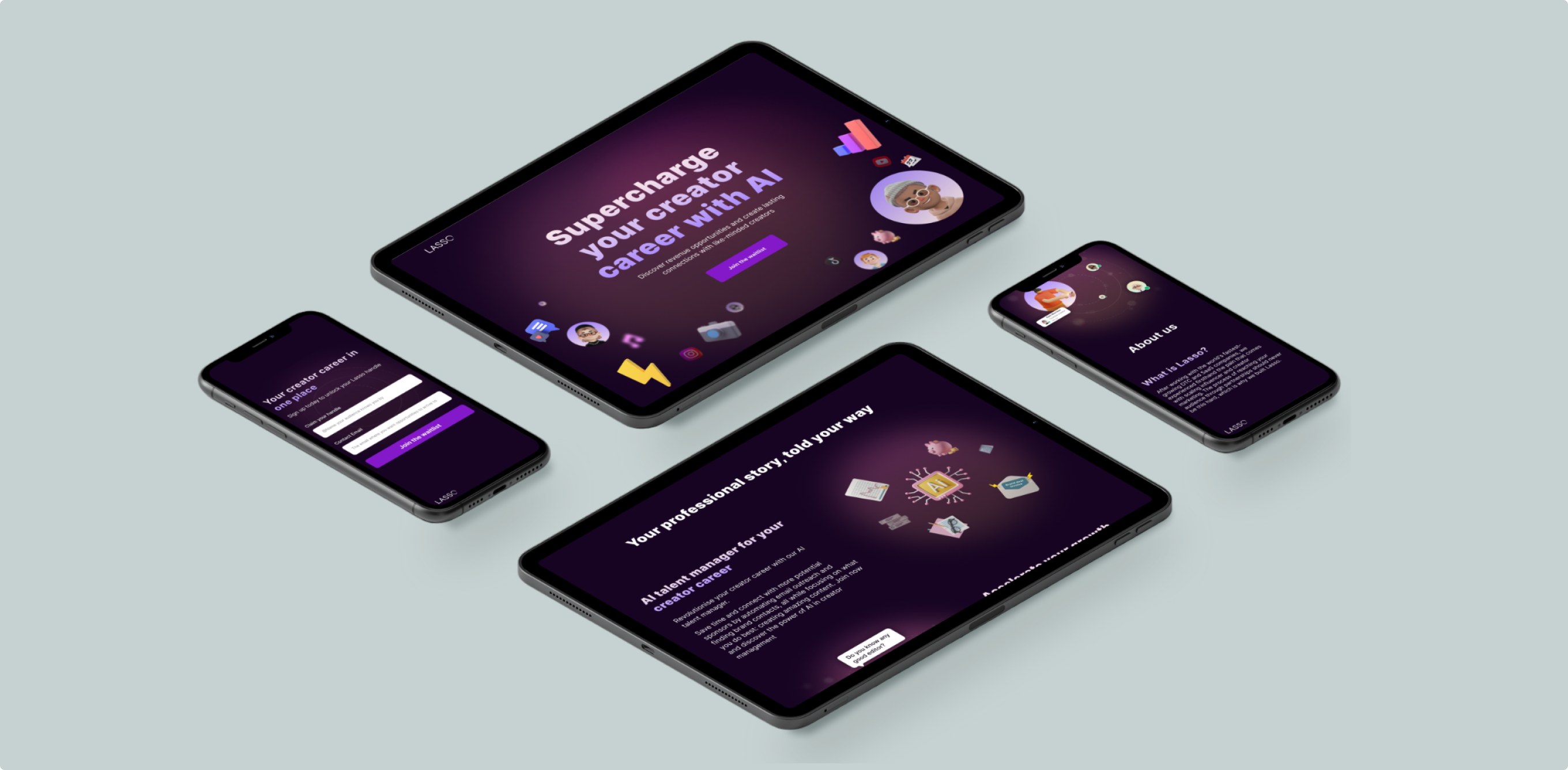
Responsive Design
Our top priority is to provide an exceptional user experience.
We have made it effortless for users to engage with our website, which can be accessed easily on any device.
Accessibility considerations
The colour contrast ratio meets the WCAG Level AAA standards.
The body type size is slightly larger than the standard size.
The CTA button size has also been optimised for easier selection by making it larger.
Conclusion
Learnings
I have realised the significance of design principles, especially in creating self-explanatory UX/UI designs.
Through this project, I was able to enhance my skills in two areas that are valuable to me:
Learned how to effectively communicate using visuals by utilising project communication tools such as Slack, Figma, and Google Meet.
Led the project from the designer's perspective, applying user-centred approaches, and defending my design decisions with clear explanations to manage stakeholders.
Next steps
In this project, UX copy was not given much priority. Some of the copies are lengthy and lack clarity. It would be beneficial to prioritise improving the UX copy for the next. Additionally, the design should be adjusted based on the results of validation testing.