ux/UI
app design
redesign
ux audit
Mobile app redesign for pizza chain restaurant- UX/UI design
Where
london
Role
UX/UI Designer
What
native mobile app (iOS)
Category
Food, Shopping
Why
Personal project
When
July - August 2022
Project Overview
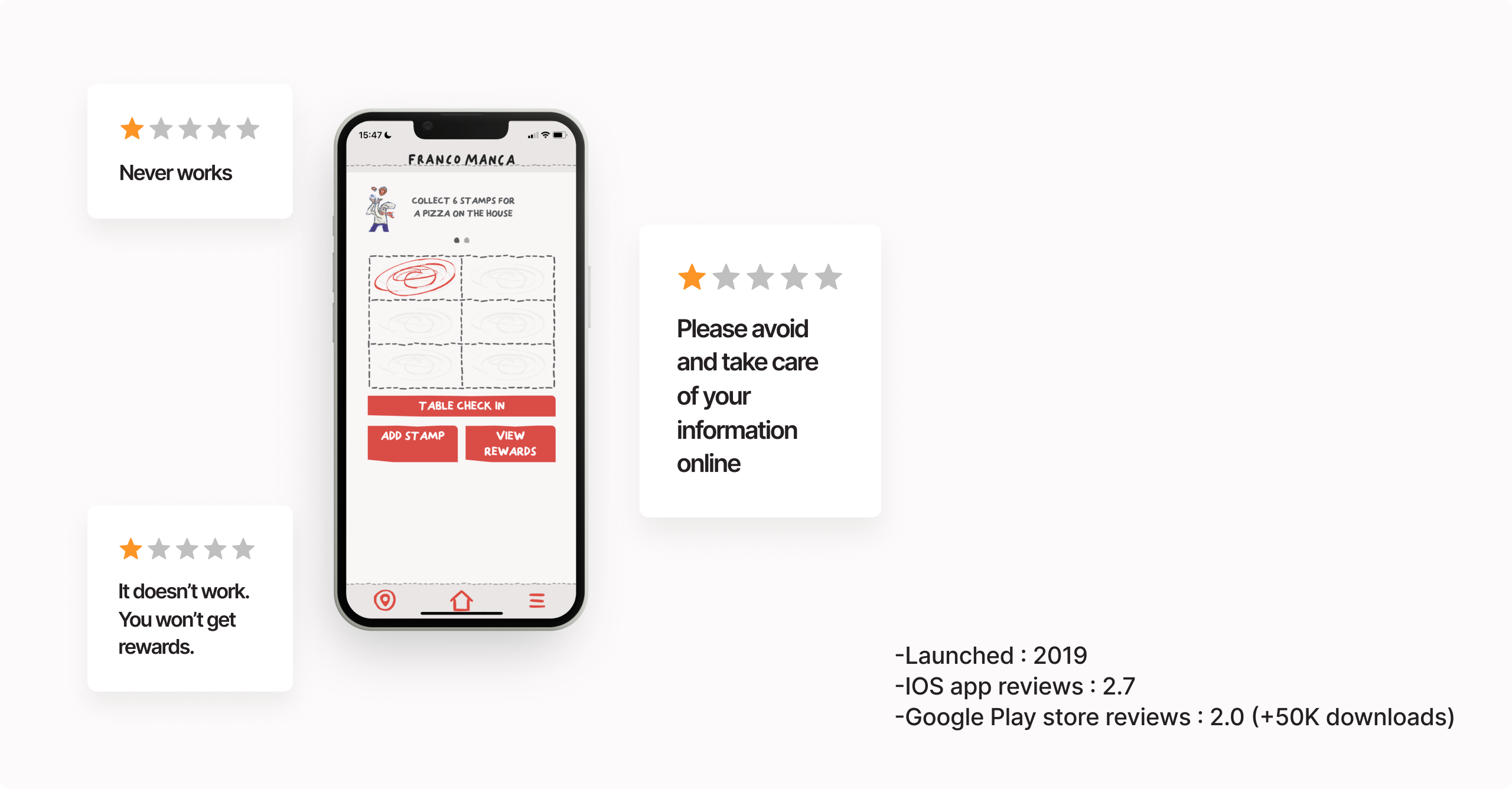
Franco Manca is a pioneering sourdough pizza in the UK and was named the UK's best Italian Restaurant on Yelp.
Sadly, most users commented their app "never works" or "it's useless".
The project goal is to identify usability issues and enhance user engagement and satisfaction for the Franco Manca app.
Contents
(jump to the section)
Design Process
I used the double diamond process that takes four main phases to get from the problem to the solution.
⁕ Disclaimer ⁕This case study is unsolicited and not affiliated with or endorsed by Franco Manca.
Discovery
Secondary research
Based on the App store review observations through affinity diagrams, severe problems occurred in the following stages.
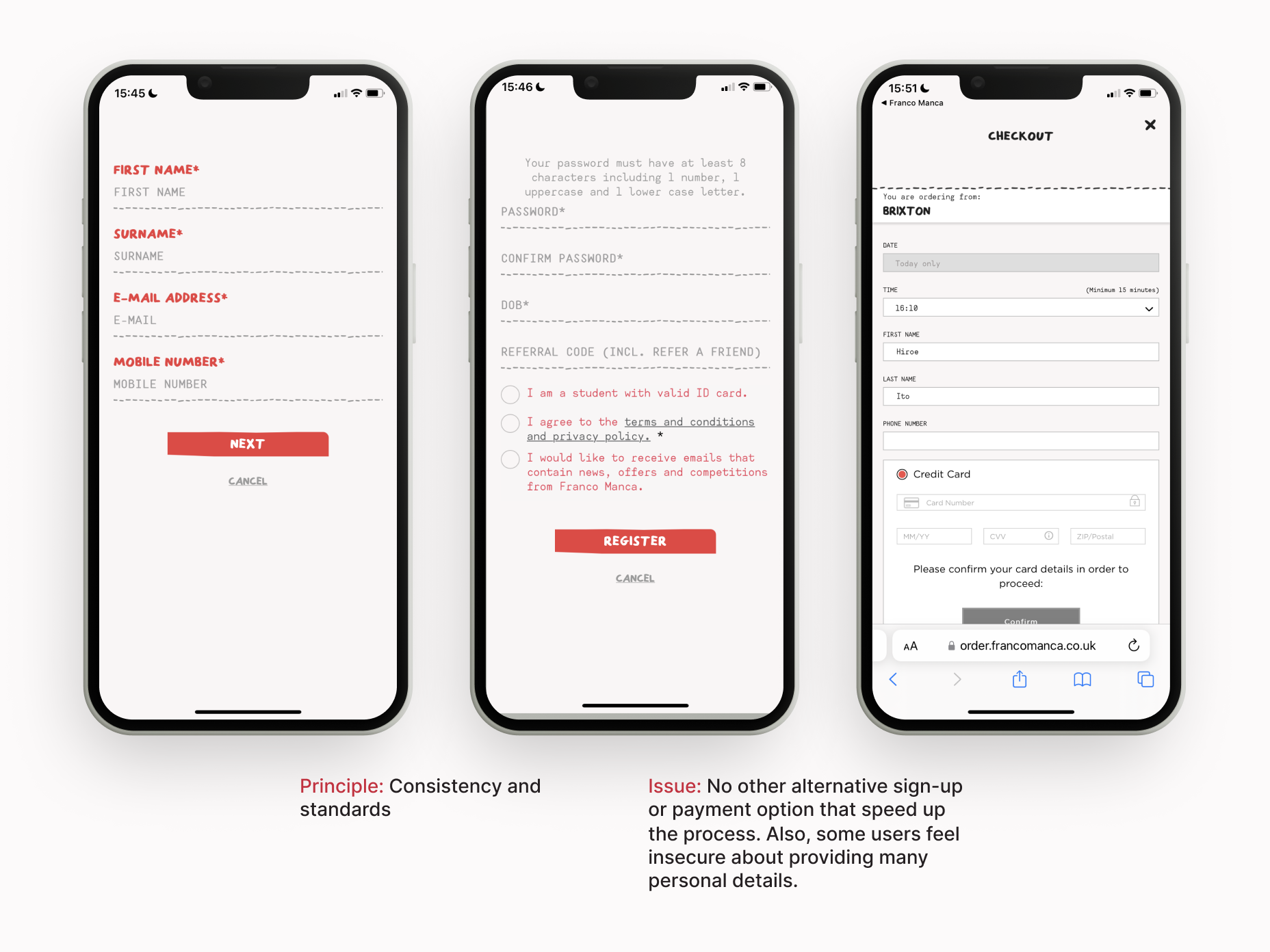
Registration
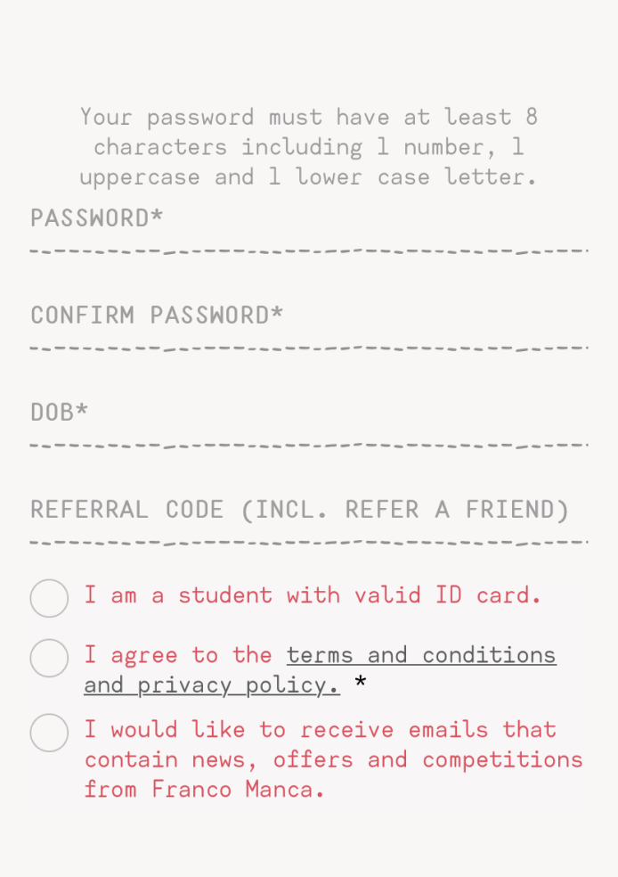
• Mobile validation is not working.
• Concerning personal info security.
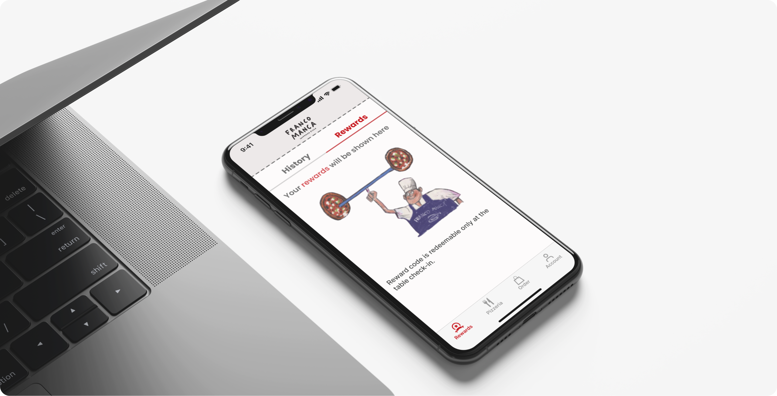
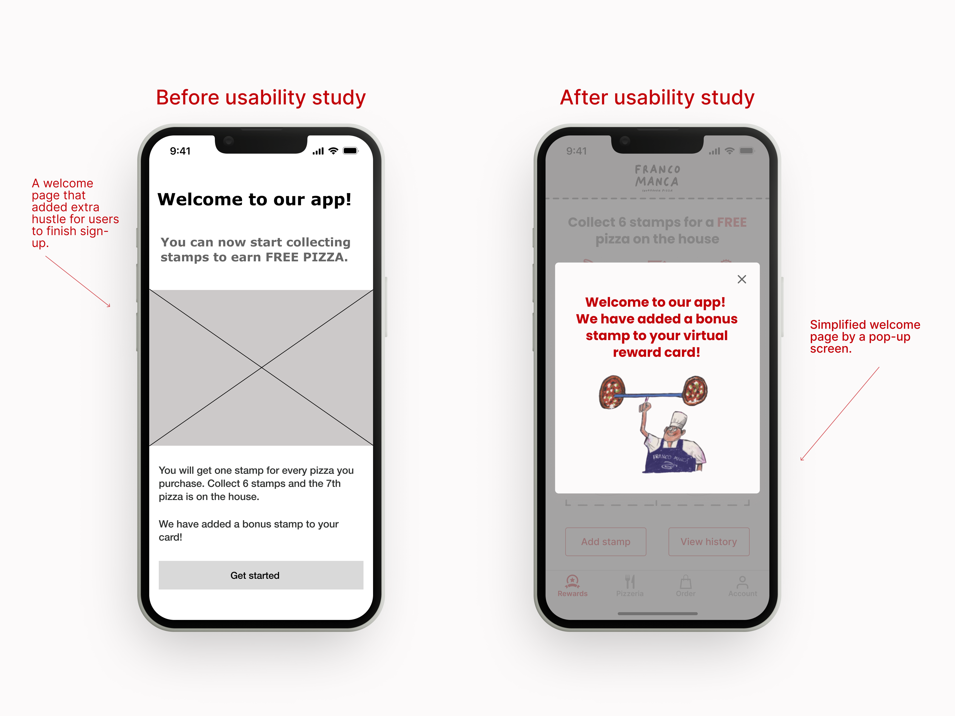
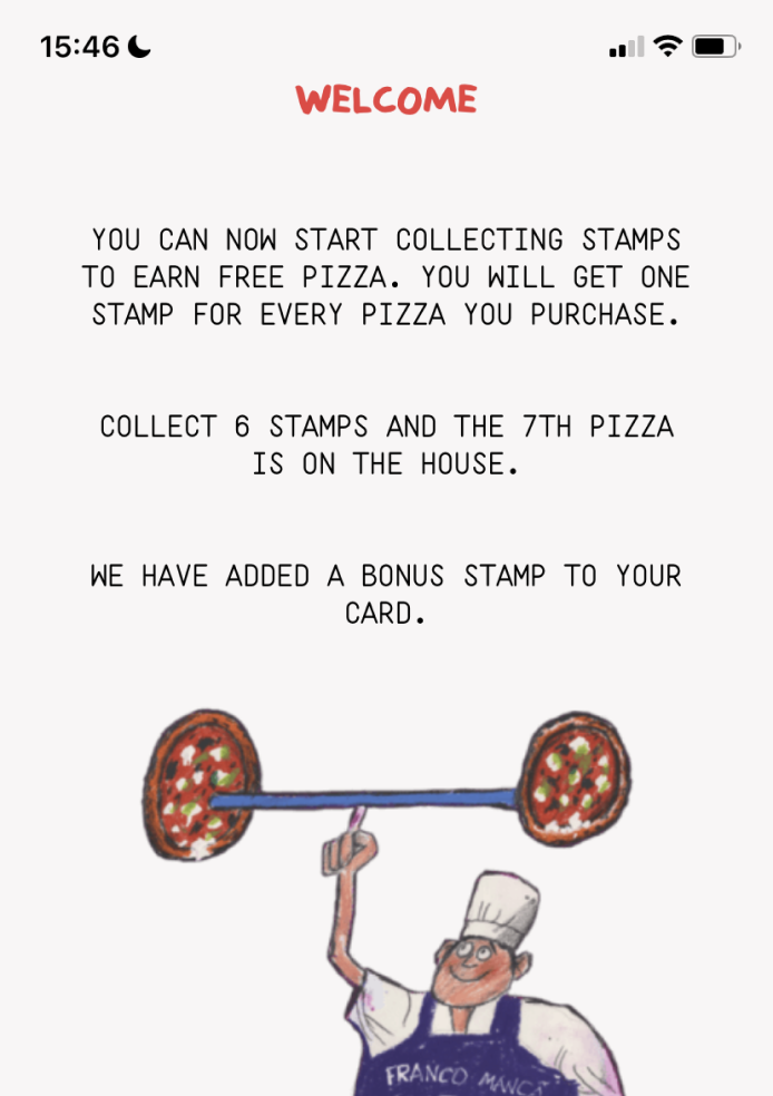
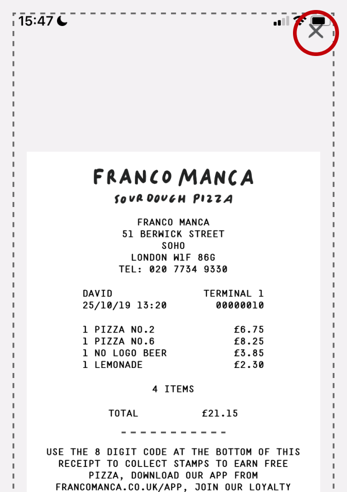
Virtual loyalty card
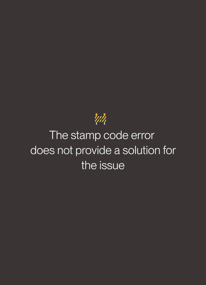
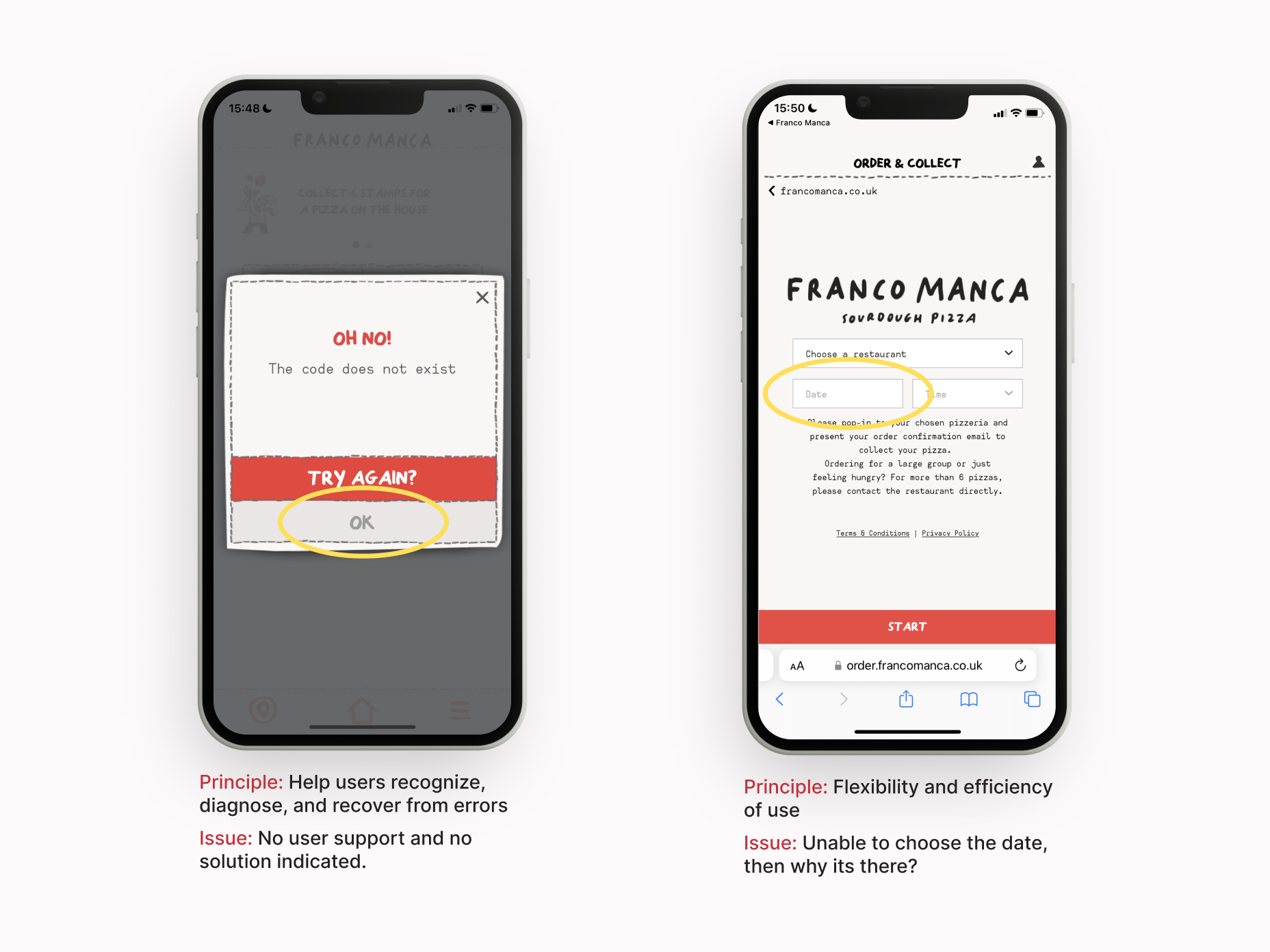
• Stamp codes are not valid most of the time
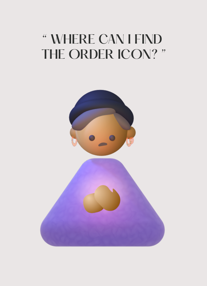
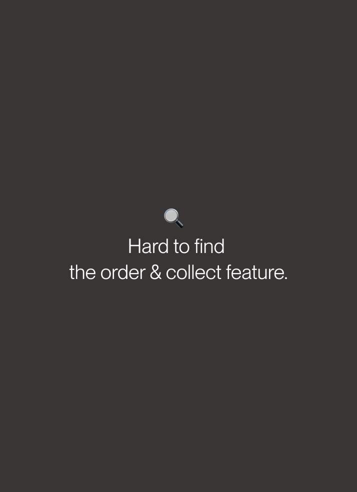
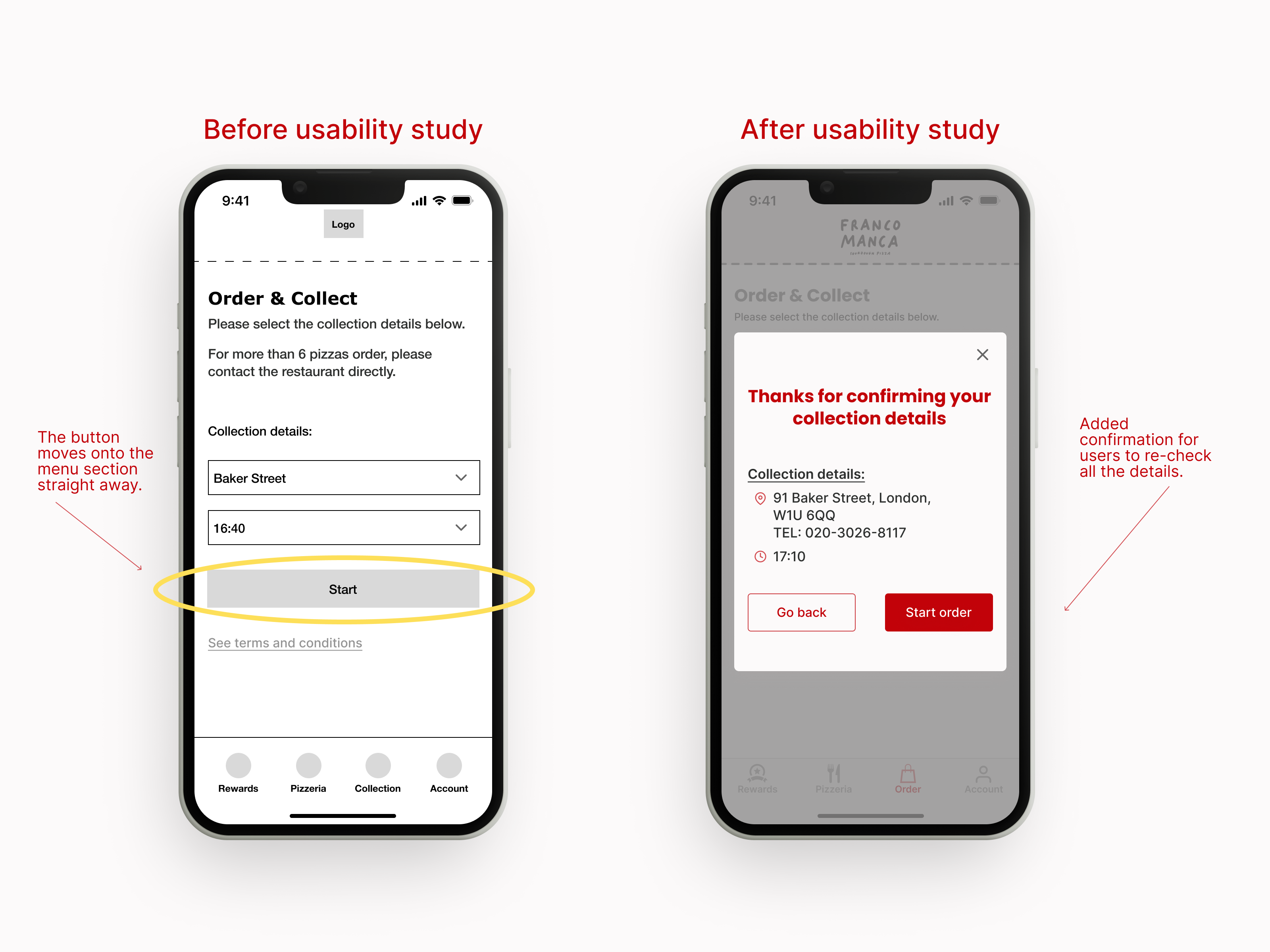
Order & Collect
• Jumping to the company's website is an extra hustle for the users.
Usability test
Having the secondary research in mind, I conducted moderated usability testing to find how users interact with the current app and their pain points.
The researcher requested five participants to complete tasks on the app to observe user behaviour and feelings.
The target audience is two males and three females 20-50 years old who are familiar with Franco Manca.

Define
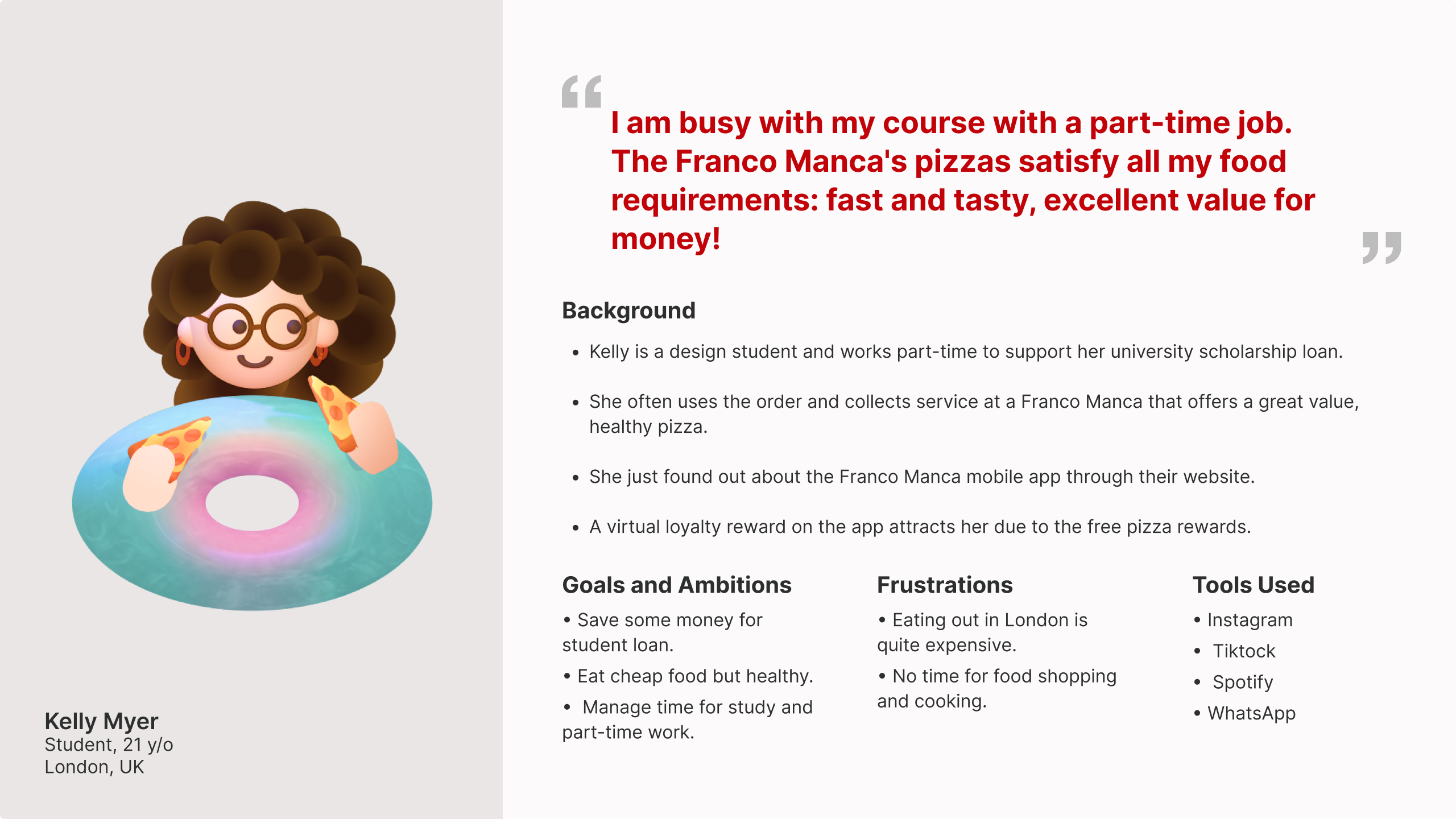
User persona
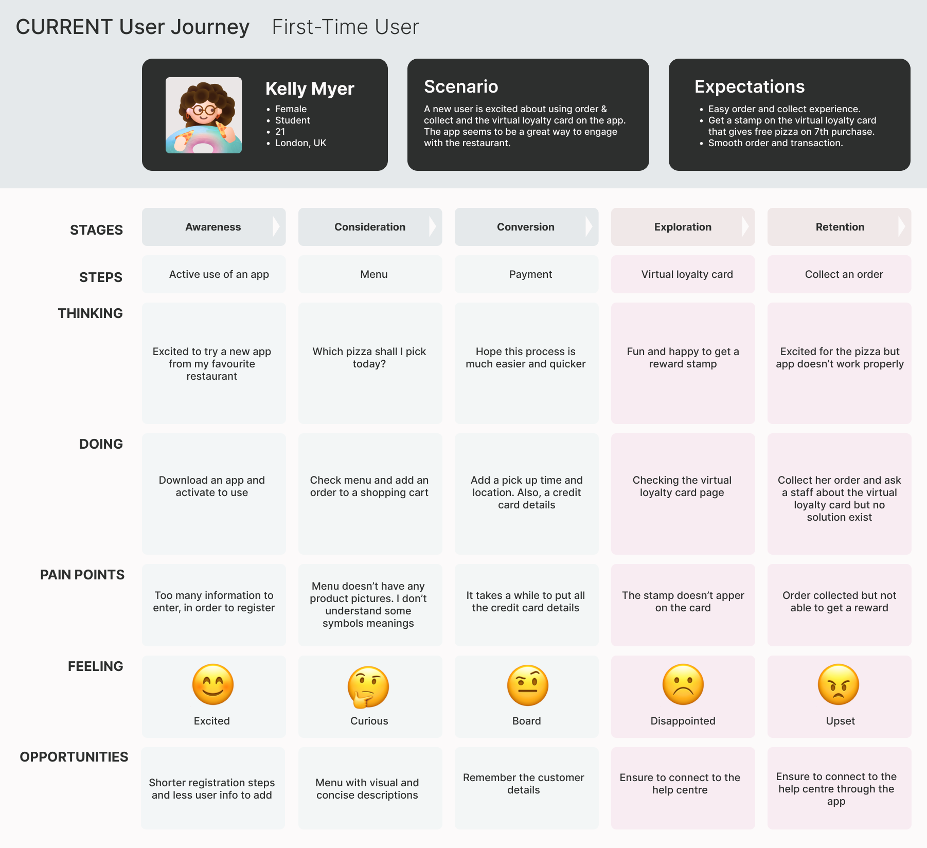
With my research insights, I first proceeded to create a user persona to represent our target users.
Customer journey map
Then, I generated two customer journey map to describe a typical target user's experience interacting with a Franco Manca app - Their progression in the journey and struggles felt along the way.

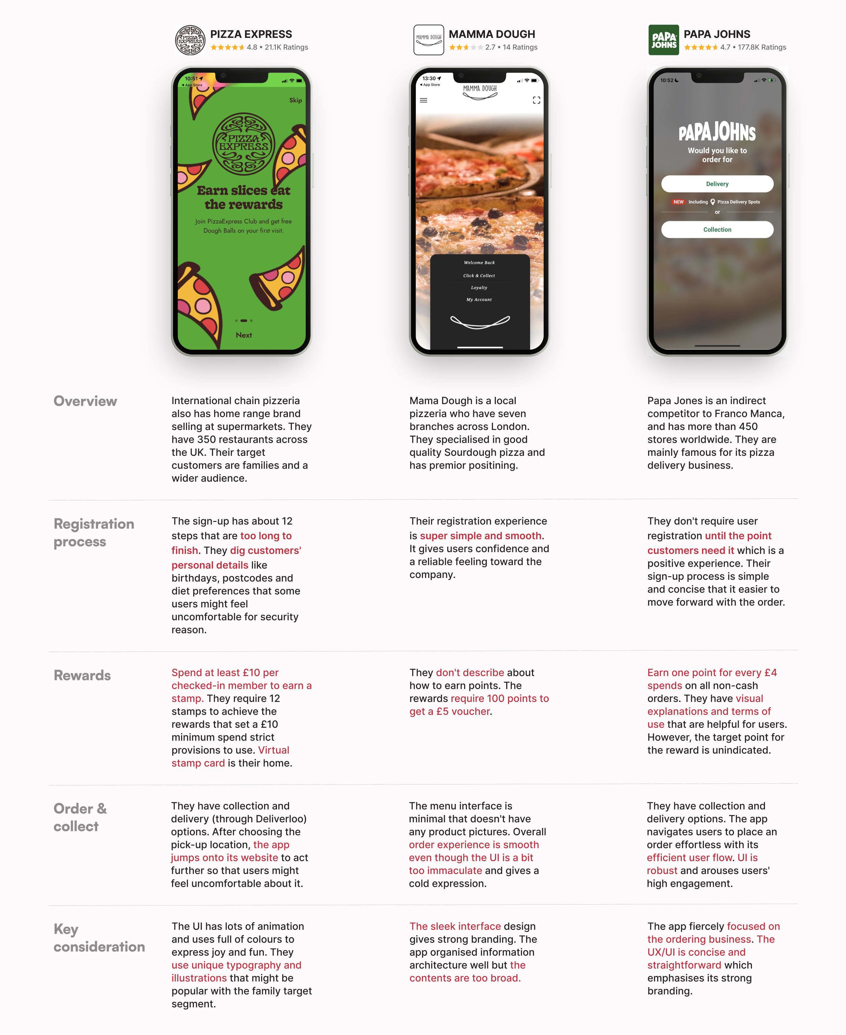
Competitive research
Understanding the market and competitor business deeper, I conducted a competitive audit to get direction on gaps and opportunities to address with the Franco Manca app.
The audit includes analysing their patterns and user flows to distinguish their strengths and weaknesses.
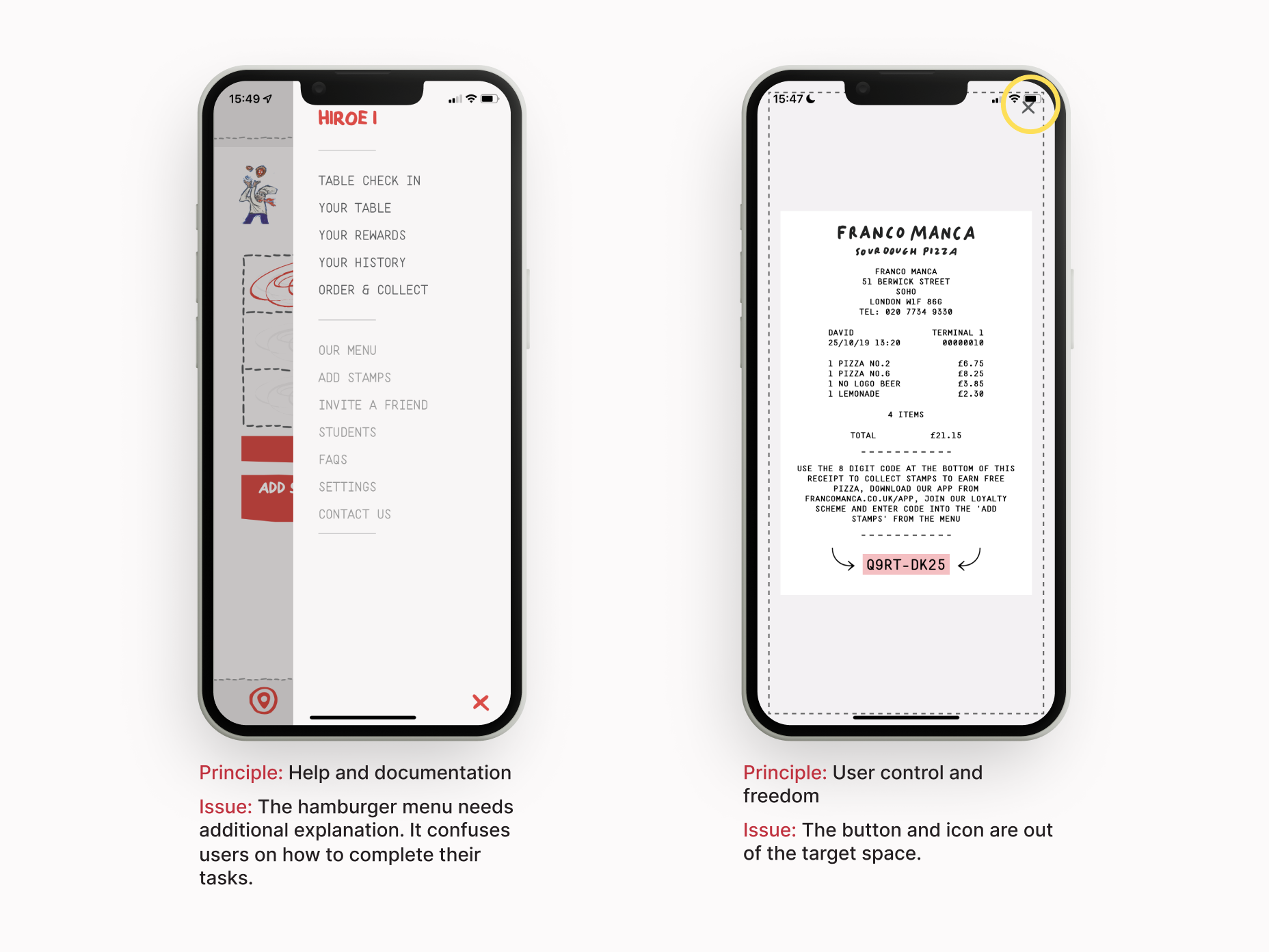
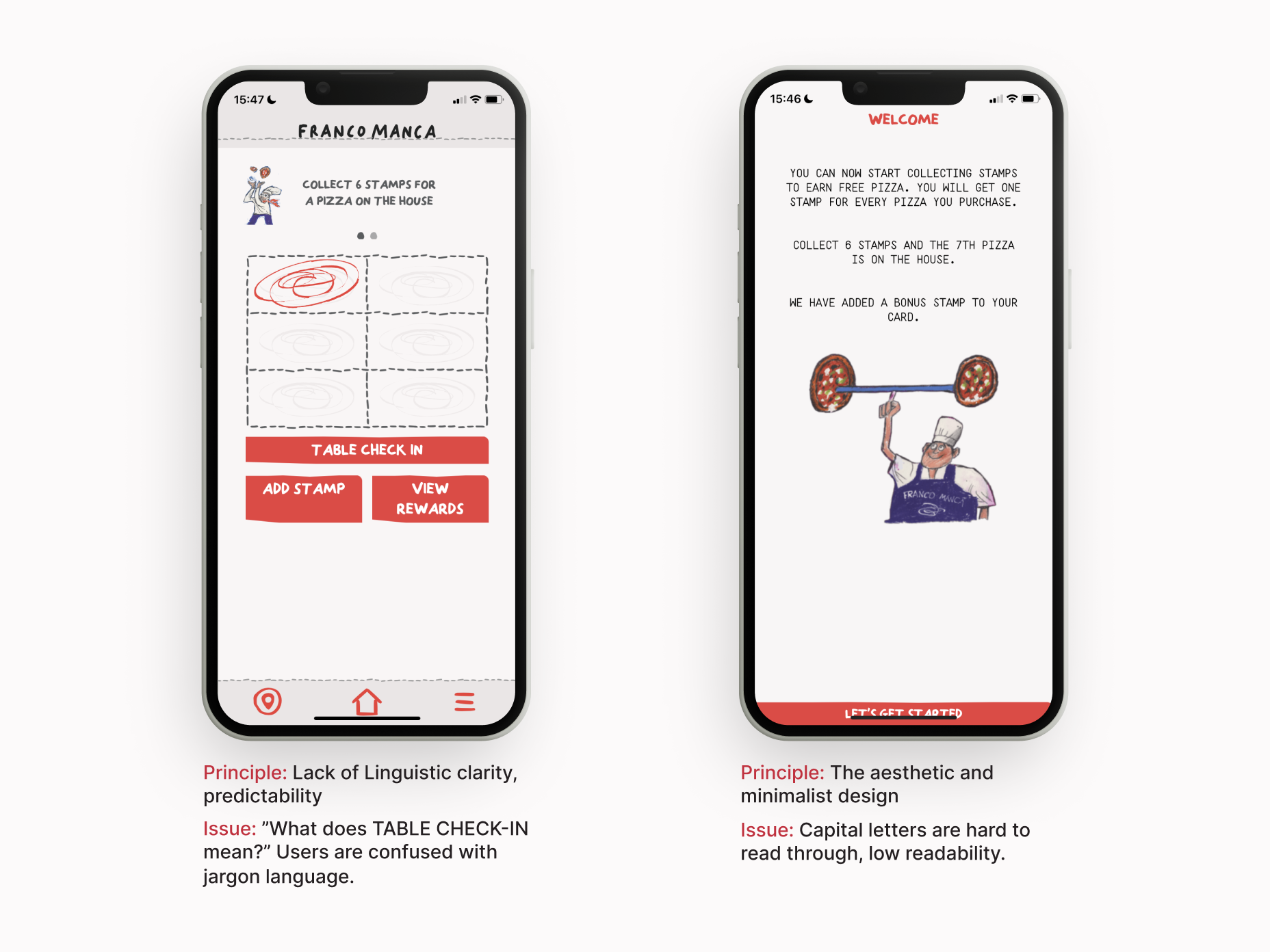
Identify issue areas with UX audit
I employed ten usability heuristics by Jakob Nielsen to find whether the design ticks all the usability boxes.
It's crucial to detect key problem areas with the existing interface. I found 7 improvement opportunities:
Develop
SCAMPER
To further facilitate creative brainstorming, I applied the SCAMPER method, which can help improve or innovate products that are underperforming in the market. It encompasses five different approaches to reimagine a product:
Safer registration experience:
• Require only essential user details during the registration process.
• Offer socials login as an alternative.
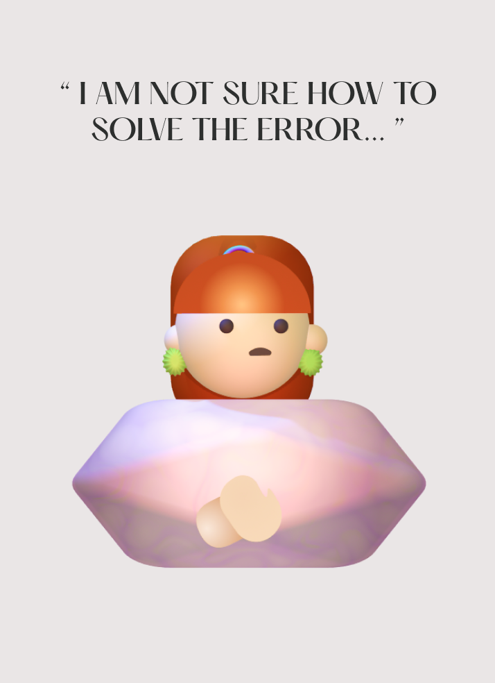
Better issue handling experience:
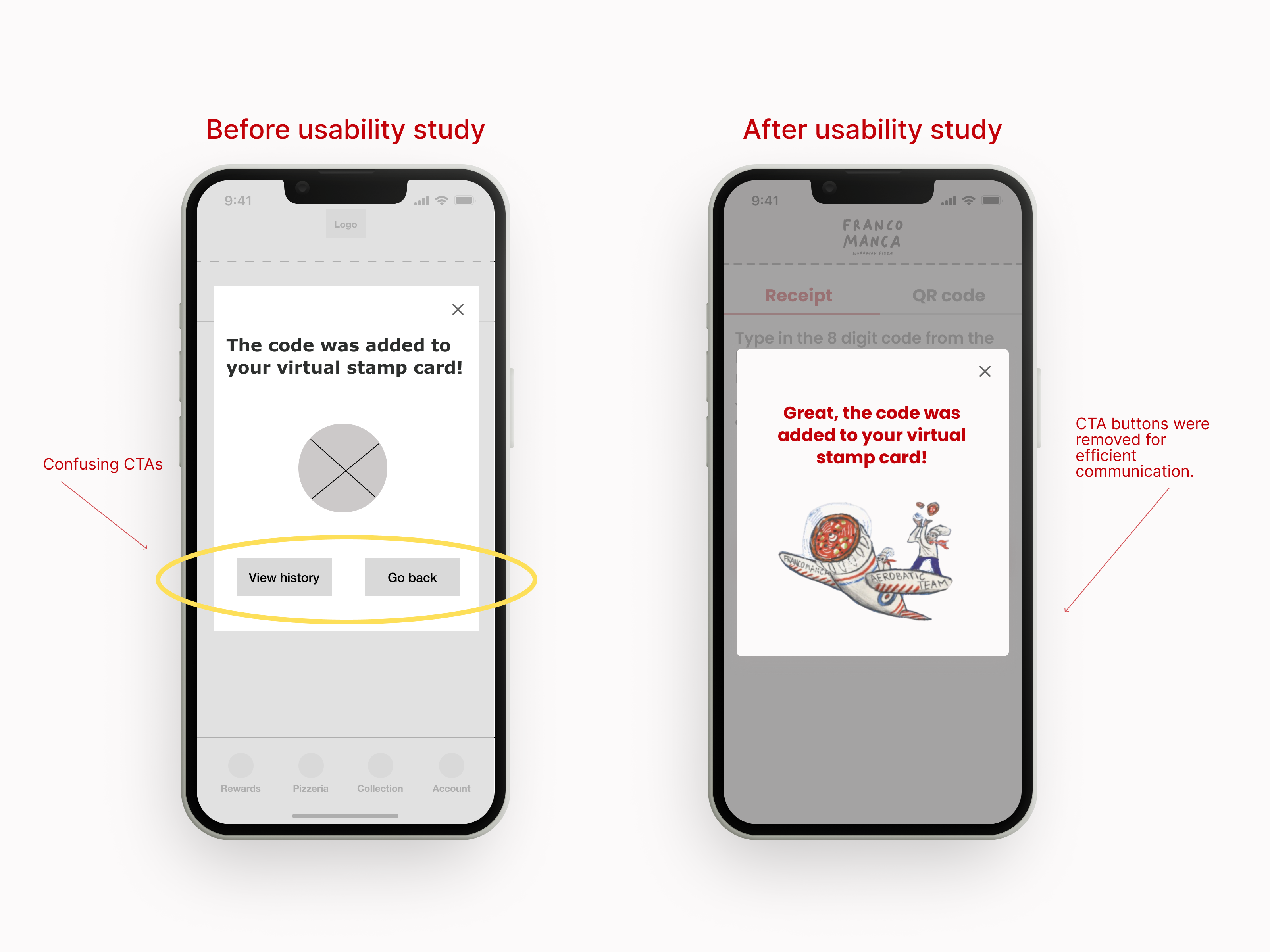
• Improving the error copy for the virtual royalty card that includes "contacting us" as one solution.
Merge the features:
• Combining order & collect and the menu supplies a smoother effortless order experience.
• stick an order through the app instead of jumping onto the company. Simplify the contents for a better user experience.
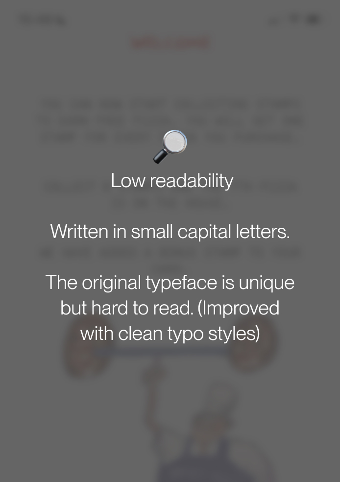
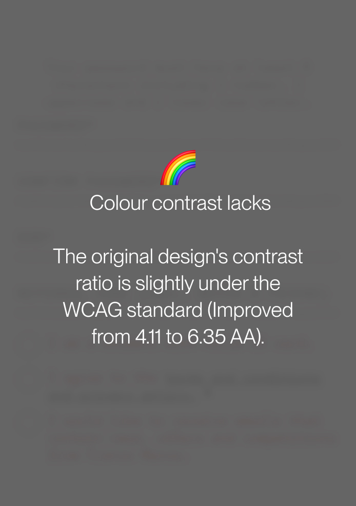
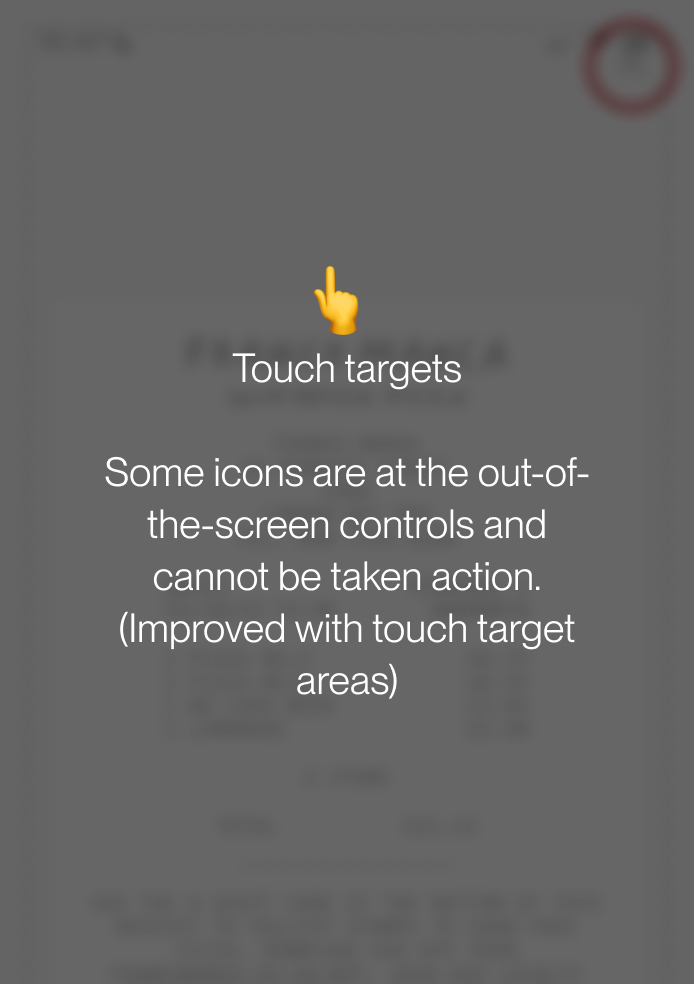
Enhance the UI design for better accessibility:
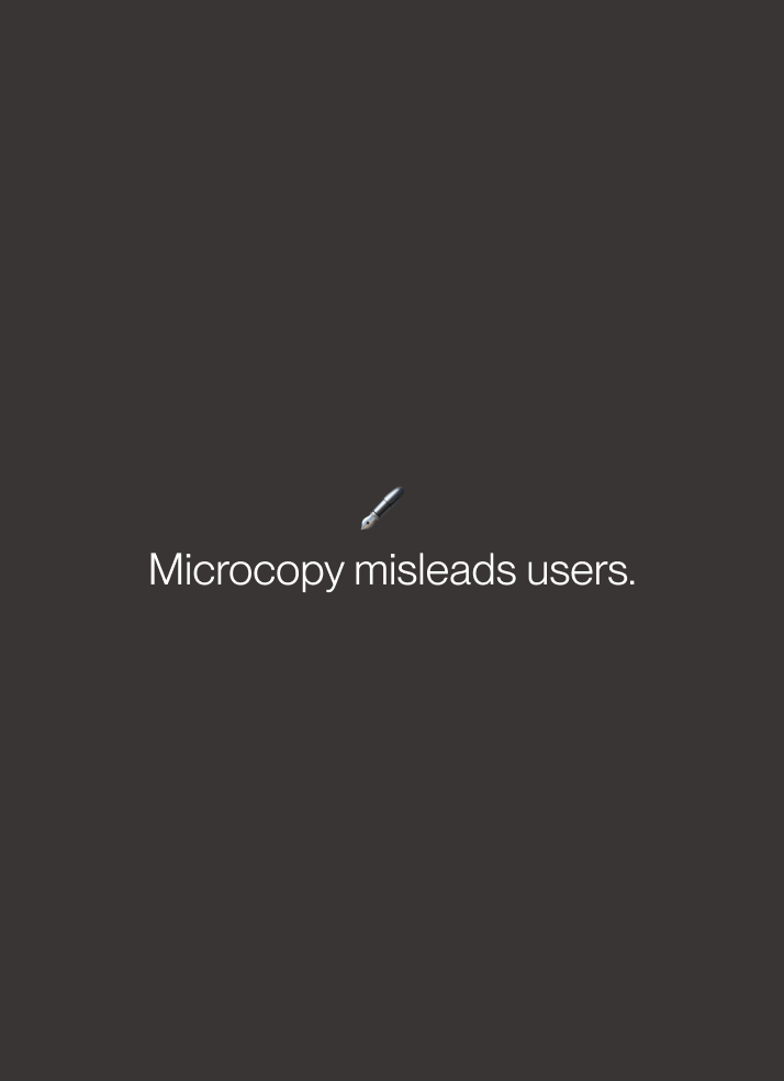
• Typeface, typo, colour, touch targets, microcopy.
Clear navigation:
• Replace the complex hamburger and bottom menu bars with a concise bottom navigation bar.
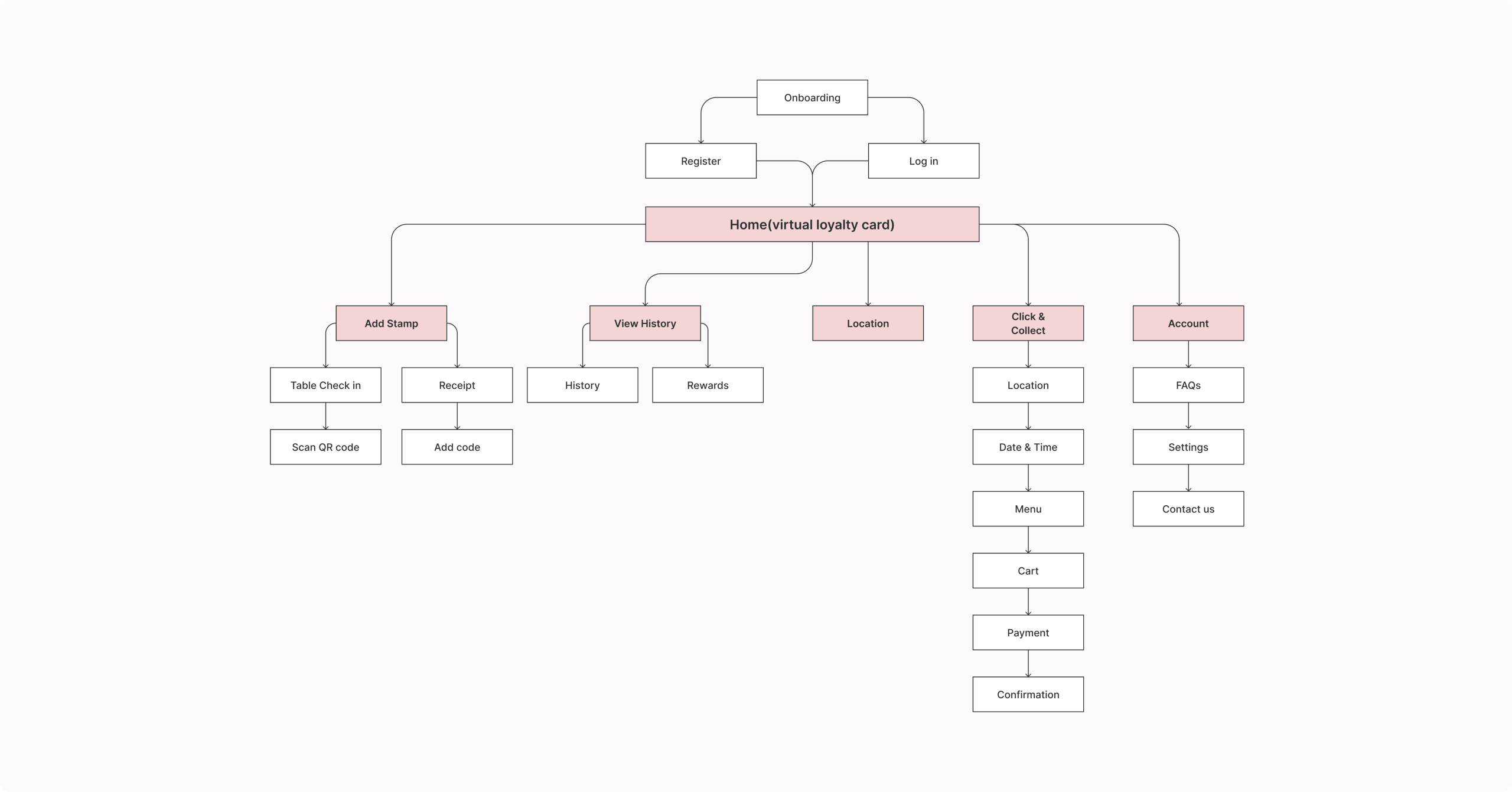
Revised Information architecture
The original information architecture is convoluted that users struggle to find the contents they want immediately.
I clarified the IA with fewer menu contents that we should robustly focus on business tracking as a priority.
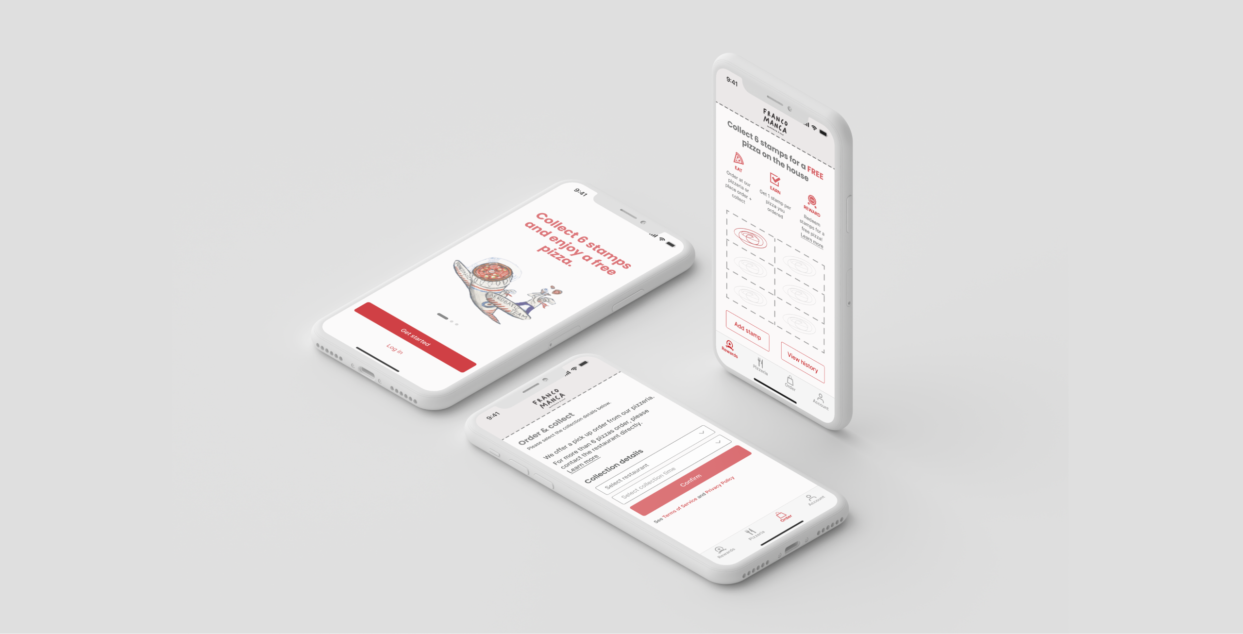
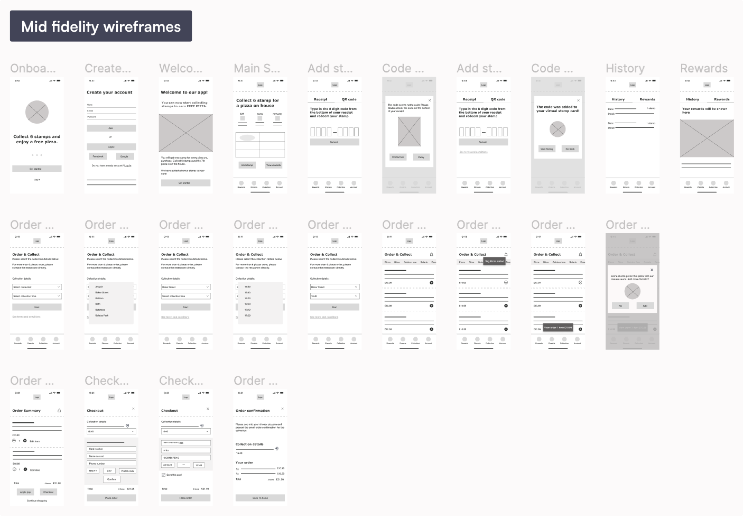
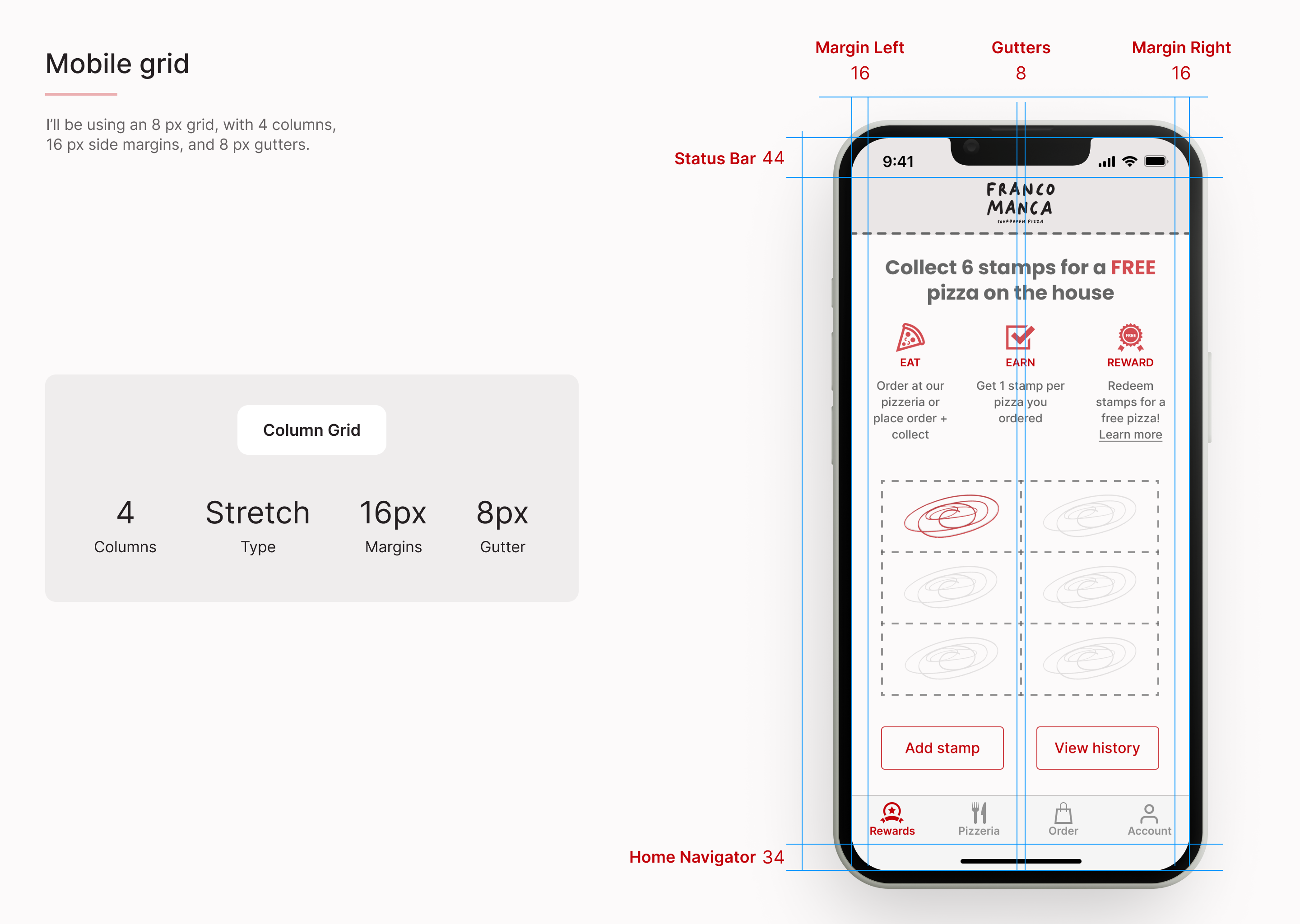
Wireframes
First, I sketched out possible solutions on paper for the main screens to generate different prototype layouts rather than focusing on design details. Then, I moved to commit to mid and high-fidelity designs for further development.
Delivery
Validation testing
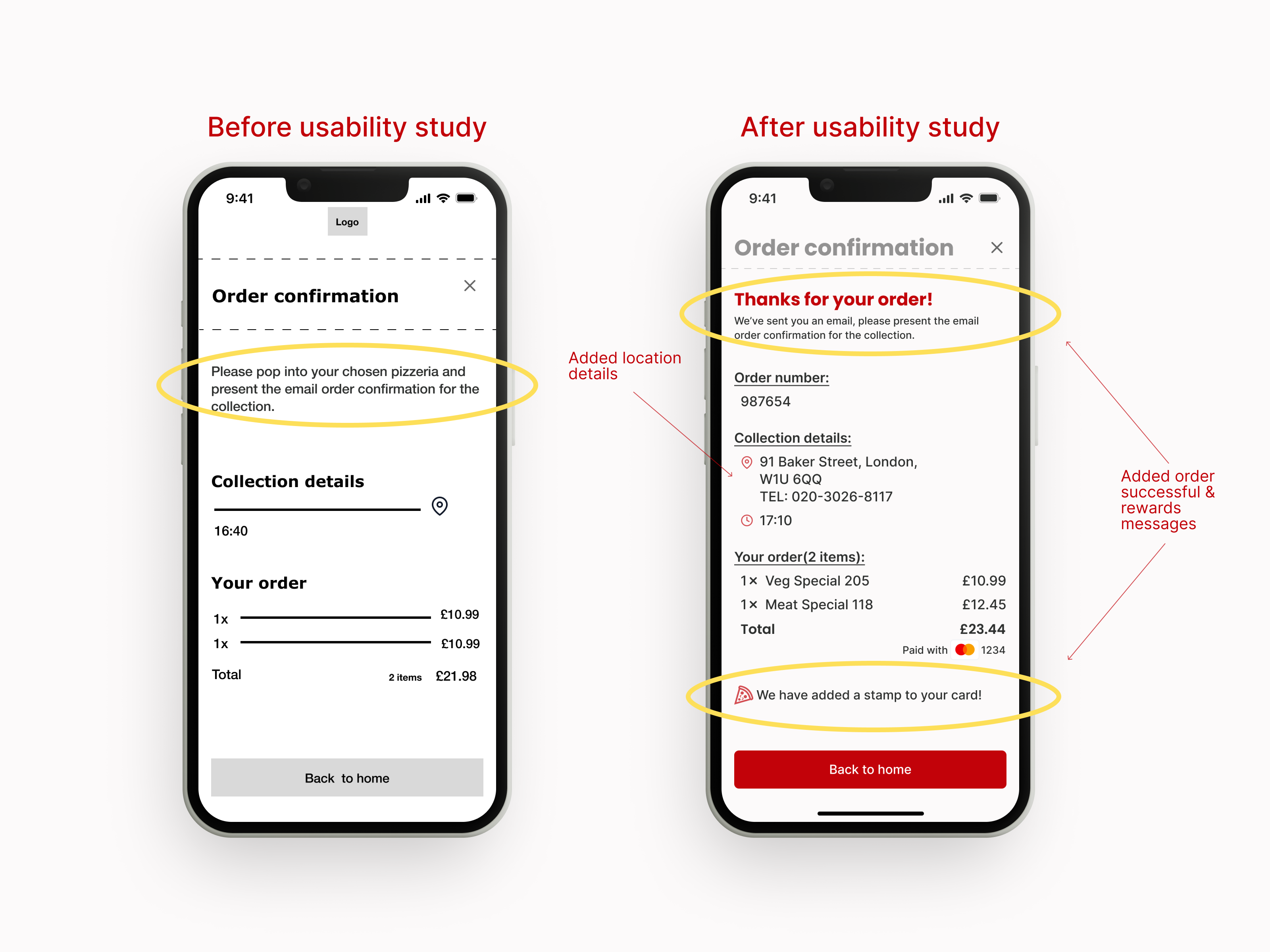
I conducted the second usability test that requested the precious participants to do the same tasks as the initial test for usability testing.
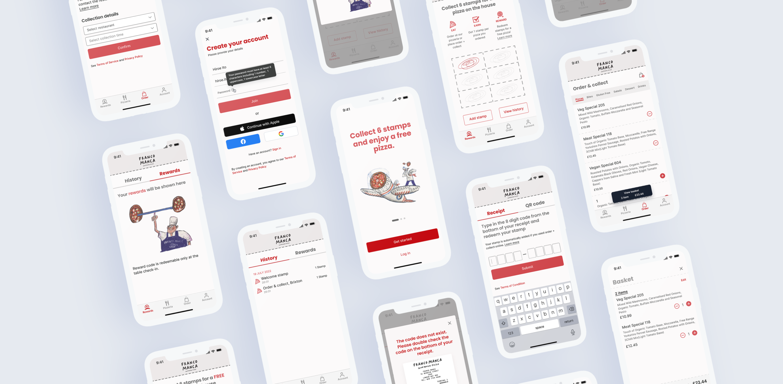
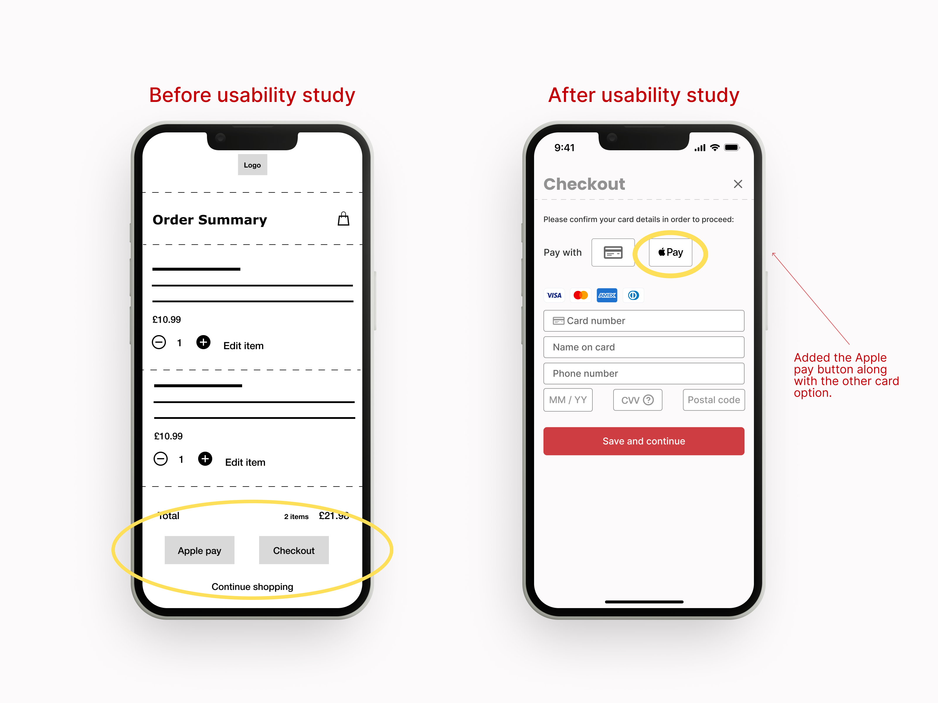
Mock ups
Here are the design improvements after having the test feedback
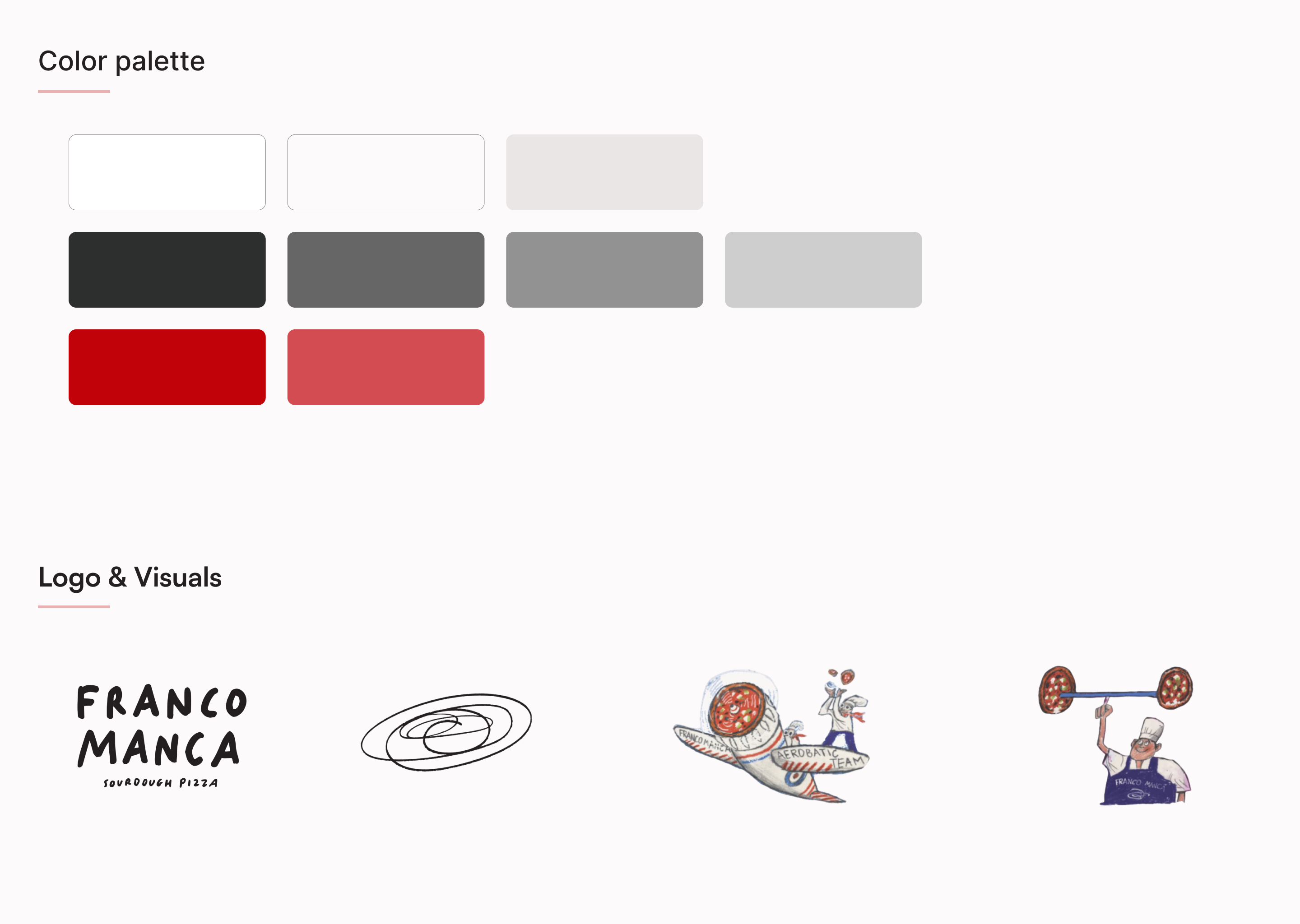
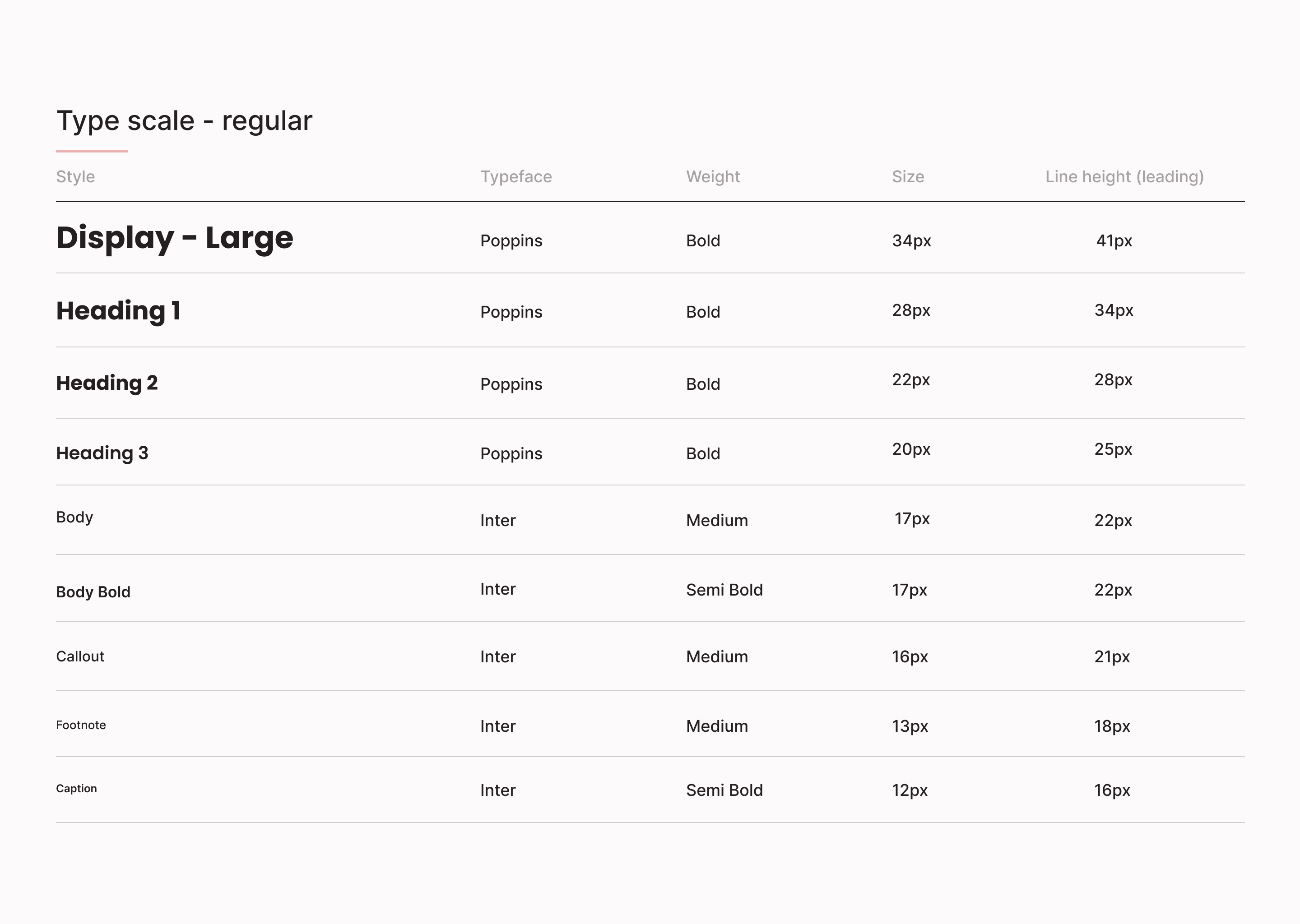
Design system
I revised the UI design kit to refine all these original UI issues.
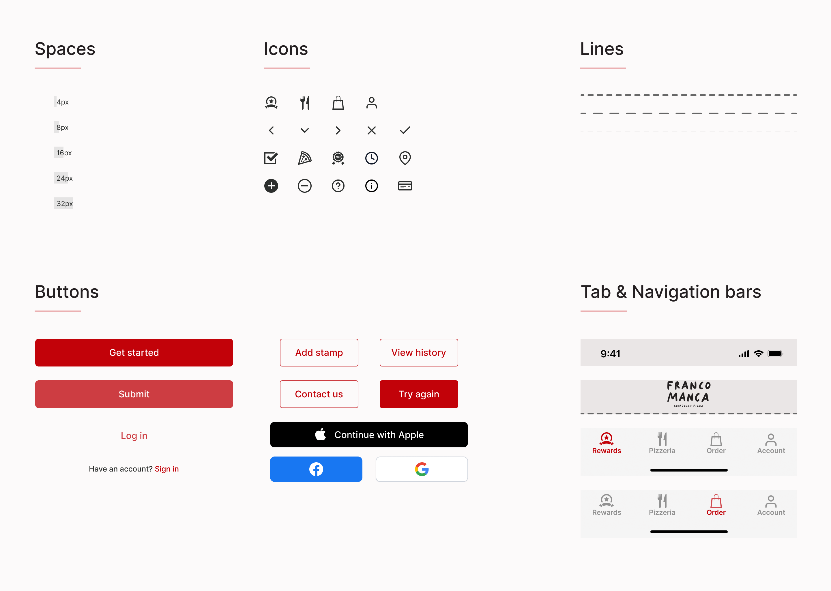
Accessibility
There were some accessibility considerations to support a better user experience.
Conclusion
It was my first redesign project and a fun problem to tackle. My main challenges were enhancing the usability and accessibility of the app to improve customer satisfaction without violating the brand image. Also, I attempted the subtle content evolution compared to the original design that minimises user alienation for the existing users.
Next step
Replace the home page from reward to order & collect page instead. The company should focus on their business to maximise its profit.
Menu with pictures for better user desirability: visuals help boost sales.
Offering also a delivery option to meet the industry standard.